05 december 2011

The newspaper as a shelving system

THE GUARDIAN iPAD APP is the most convincing and original response so far to the challenge of shaping a daily newspaper on the conditions of the tablet.

IN THE SAME WAY as early automobiles looked like horse carriages, the pioneers among newspaper and magazine apps have born a striking resemblance to their origin: newspapers and magazines. For this as well as other reasons, sometimes it might have been a bit hard to see what important needs this new publishing format was actually meeting … if you count away that luxurious feeling of being able to read your Danish morning paper by an Italian swimming pool.
It has been claimed that the so-called tablet has the potential to change our reading habits – and now all of a sudden, this statement sounds more plausible. An important change appeared two months ago when the British newspaper The Guardian launched its long-awaited iPad app. Which looks nothing like a newspaper. It looks like a Mondrian painting. Or, even more perhaps, it looks like a Montana shelving system.

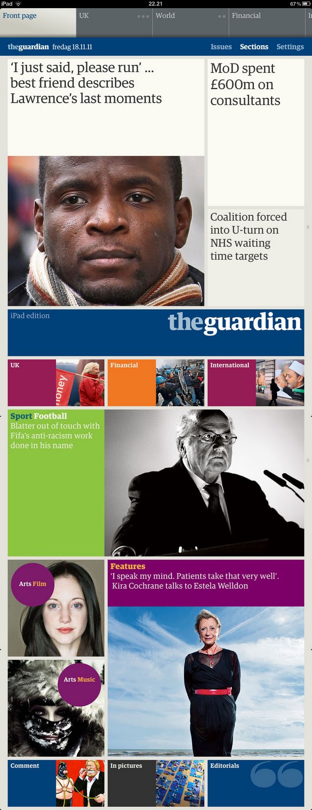
NAVIGATING IT will give you the same pleasant feeling as walking around inside a great piece of architecture or using a really well-designed tool. The surroundings are simple, beautiful, and functional, and using this application feels natural and intuitive from the very first visit.
The architecture is profoundly simple, based on a grid consisting of squares which can be combined to form rectangles of varying shapes and sizes. The typography has been completely adjusted to the grid and this contributes to the overall impression of quality.
Content-wise, the iPad version is based on the daily paper, and transformation into tablet format is done semi-automatically. A script analyzes the InDesign pages and reshapes the stories while preserving the editorial hierarchy. The publisher’s ambition is to give readers the same sense of overview as when browsing through a ”real” paper – in which headlines and other ”landing spots” on the pages will give you a taste of all the stories, even the ones you decide to skip.

IN MY EYES, it does not work quite that way. Partly because some headlines, true to the anglo-saxon newspaper tradition, are more elegant than informative. This app inspires eclectic reading rather than it provides you with the complete overview offered by the traditional newspaper. However, reading the consistently well-written stories, typeset with the unique body type of The Guardian, on an iPad is an exquisite pleasure. And the video clips accompanying some articles make this reader feel like entering the world of Harry Potter.

CRITICAL VOICES have noted that the Guardian iPad edition is in fact outdated by the time of publication, just like the printed newspaper, and that it ought to include more interactive features such as readers’ comments. To me, this critique seems a bit misplaced; if you have a wish for constant updating, it can be perfectly fulfilled by the excellent Guardian website – to which, by the way, the iPad edition is linking comprehensively. This app is something else.

IT WILL BE INTERESTING to see how the elegant yet powerful colour palette marking the different sections – at the same time as it creates a very Guardianish atmosphere – will work when ”real” ads begin to appear on the pages. For the first four months, the entire publication is being sponsored by Channel 4, and outside the UK, their advertising space will be filled by The Guardian’s self-promotion.
The app, which was built for iOS 5 and works only on an iPad 2, comes for free until January 13, 2012. After then, a monthly subscription will get you rid of GBP 9,99.


01 december 2011

The Politiken redesign: Much ado about n…

POLITIKEN, the Danish morning daily which has won loads of design awards in recent years, launched a modest redesign today. Mediawatch asked me what I thought.
Here’s the interview – in Danish. In case you’re interested and do not read Danish, perhaps now is the time to test Google Translate …

Text by Tine Brødegaard Hansen

De oversælger redesignet”
Politiken slår lidt for meget på tromme for nyt design, som indtil videre giver mindre logik til broadsheet-formatet, mener designkonsulent Ole Munk.

Broadsheet-formatet får ikke mere liv af Politikens nye design, der skal sikre læserne bedre overblik og mere fokus på nyhederne, mener designkonsulent Ole Munk fra Ribergård & Munk, der har stået bag flere redesign af aviser.
“Det store problem er, at avisen ikke har stof til at udfylde de kæmpe sider. Derfor er det vanskeligt at begrunde, hvorfor avisen skal være broadsheet,” siger Ole Munk og tilføjer:
“Størrelsen på billederne er kun i få tilfælde berettiget, og for eksempel er det latterligt, at billedet af Margrethe Vestager på side 19 fylder en kvart side. Det tilfører ikke noget journalistisk til historien, og det er der mange af billederne som ikke gør.”


Side 8 og 9 domineres ikke af journalistiske billeder, men af en stor annonce, hvilket Ole Munk også hæfter sig ved.
”Når man læser de sider på en iPad, kan man se, at indholdet snildt kan være der, mens det fylder seks gange så meget i avisen.”
Det samme gør sig gældende for 2. sektions bagside, der ligeledes kunne være skaleret ned, og dermed havde virket bedre, mener Ole Munk.
Argumenterne om, at broadsheet sikrer overblik og giver plads til flotte grafiske elementer og fotos holder ikke helt, ifølge ham.
“Så mange fantastiske billeder er der ikke i avisen, så det sande argument for den størrelse er nok nærmere, at annoncørerne er glade for at få så meget plads.”
Afskaffelsen af nyhedsbåndet med citathistorier i toppen af siderne er den ændring, der får mest ros af Ole Munk.
“Nyhedsbåndet var en konstruktionsfejl fra starten, fordi det så ufattelig kedeligt ud, og fordi de små tekster var langt væk fra læserens øjne. Så det er en god idé, at der er lavet en mere iøjnefaldende løsning,” siger han om elementet ’overblik’ med korte historier, der nu er samlet i en sidespalte.
Ole Munk mener ligeledes, at ambitionen om at skabe mere overblik, blandt andet ved hjælp af avisens side 2, er vellykket.
”Politiken har mange gode folk, der kan deres grafiske håndværk, og man kan generelt sige, at overblikselementerne er veludførte og fungerer godt. De grafiske elementer hjælper læseren med at navigere i avisen,” siger Ole Munk.
Han mener dog, at der er slået lige lovlig meget på tromme for ændringerne, som har fået flere helsider op til det nye design gik i luften i dag.
”De oversælger redesignet og overvurderer også betydningen af ændringerne for oplevelsen af avisen. De ting, der er meget store, når man arbejder på avisen, er ikke så store og betydningsfulde for læserne. Så det kan virke lidt komisk. Retfærdigvis er Politikens læsere dog et nichesegment, der nok tillægger avisens design større betydning end andre avislæsere,” siger Ole Munk, som mener at avisens ”første forside”, der består af en humoristisk tegnet fortolkning af avisens normale forside, ikke ville fungere andre steder.
”Tegningen på forsiden er vidunderlig, og det sætter Politiken-læsere pris på. På Berlingske og Jyllands-Posten ville sådan en forside have været en katastrofe,” siger Ole Munk.

Politikens tegnede forside 1. december 2011:


12 november 2011

The fear of being original

IN A RECENT COLUMN at Medievarlden.se, the former editor-in-chief of Swedish local daily Västerbottens-Kuriren, Lasse Westerlund, suggests that newspapers should stop giving away their key product for free by publishing news on the web.
In numerous comments and tweets, mr Westerlund has been ridiculed as being regressive and, among other things, his opinions have been compared to those of an unimaginative steam engine driver in the early 20th century.
I totally agree that it would be more than stupid to try neglecting the fact that the internet is here to stay, and that the reading habits of people who (used to) buy newspapers are rapidly changing. However, if for a moment we put aside the question of technical platform (print, iPad, mobile, etc), there also seems to be quite a lot of stupidity – or, at least, lack of ability to think out of the box – in the way many newspapers just keep putting their highly valued goods at everyone’s disposal, including that of their competitors, without charging anything for the service.

ANOTHER EXAMPLE of thoughtlessly mimicking the behavior of others without considering the consequences is the way many newspapers allow advertising to totally dominate their visual environment, and thereby seriously hurt their own brand recognition (see an example here) as well as their esteem (for those who have got anything left to hurt).
So why is just about everyone running in the same direction? Few people would argue that giving away your product for free, or allowing some supermarket or car manifacturer to take over the visual gestalt of your news website, are intelligent strategies. More likely, these are behaviors deriving from a fear that if you do not make the same moves as all the rest, you might end up being the one who fails.

AS FOR GIVING AWAY NEWS FOR FREE, other strategies have in fact been tried. The whole discussion of paywalls is big and complicated and I do not imagine that I can make any intelligent or original contributions (just read that the website of the Financial Times now has more than 250,000 paying subscribers, but then again, business news is special) … but I would like to mention a different approach which appears to be successful.


IN DECEMBER 2010, overnight, NRC.nl (the website of Rotterdam-based dailies NRC Handelsblad and NRCnext) ceased to automatically publish all news from the two papers. After the initial couple of weeks filled with angry protests, users actually began to appreciate the new contents of the site and, according to NRC.nl editors, the number of visitors have now doubled compared to how things were before the change.
Instead of traditional news, NRC.nl now offers two parallel flows of content. One is named Het Beste van het Web (the Best of the Web) and works more or less like a traditional news aggregator, except that the stories, photos, videos and sound bites which it aggregates are not necessarily news – it can be any kind of content from everywhere on the web, as long as it is interesting.
The other flow contains comments, analysis, interviews, etc, related to stories which you can read if you choose to buy one of the papers.
For instance, if the NRC print (and tablet) publications are writing about the European debt crisis – which, no doubt, they are – an NRC.nl reporter might interview the financial expert at the NRC desk and make him or her explain how the whole international banking system works, or maybe list the strengths and weaknesses of the euro currency.
This works as a smart way to approach user segments different from the traditional newspaper audience and, at the same time, it is an effective method for NRC to promote their paid products.

NRC.nl DARED TO DO SOMETHING DIFFERENT – and something original. Apparently, they have succeeded. However, as the internet is still such a young media, or whatever you’d call it (whether the internet can be called a media or not seems like a never-ending discussion), there has to be hundreds of other ways to capitalize on its possibilities.
Therefore, it is not necessarily stupid to state that newspapers should try something else instead of just publishing their news and hoping that advertising will pay. Because that business model clearly isn’t working.

In case you are interested, you can read more about the NRC.nl project in a review which I wrote for the Danish Journalisten magazine earlier this year.

15 oktober 2011

When a close friend panics

OFTEN AT THE START of a newspaper redesign process, when discussing with a new client what will be the right approach, I have compared the newspaper’s relation to its readers to that of a close friend. Their daily newspaper is someone who they see regularly, someone with whom they feel comfortable, someone whose opinions they value, and someone they rely on.
And how do we want our closest friends to be?
Speaking for myself, I appreciate if they basically stay the same – because the way they are was an important reason why we became friends in the first place – and yet sometimes give me small surprises by showing new sides of themselves or by making subtle changes, like getting a new haircut, or playing a different kind of music for me, or taking on a new hobby, or maybe expressing a new point of view on something which we might have discussed before. These are signs that we are still alive, and who doesn’t want that?

HOWEVER, IF A CLOSE FRIEND suddenly turns up looking totally different, or behaving strangely, or his or her tone of voice sounds completely new, I tend to worry rather than be amused. Such a dramatic change will usually be interpreted as a sign of some kind of identity crisis … and every now and then, you may sadly realize that the person you used to consider a close friend has turned into a stranger, and your friendship may weaken and eventually dissolve.

I BELIEVE THAT THE SAME THING can happen to a newspaper.
Sometimes, a newspaper may change its visual appearance so drastically that its readers can no longer recognize the newspaper – and the reading experience – which they used to like. And this will increase the risk that the friendship (as well as the subscription) will soon come to an end.

THE INDEPENDENT of London is not one of my personal close friends but I have always found the paper interesting and worth a look. Its 25-year history is one of almost constant crisis and for at least five years now, circulation figures have been in what seems like a free fall.
Nevertheless, more than 150,000 Englishmen still buy the paper every day.
And looking at how the design of The Independent has been changing ever since 2003-04 when ”Indy” made its latest bold and successful move – the famous nine months in which readers were allowed to choose between a broadsheet and a tabloid version of the paper – my concern would be that for each and every one of these radical redesigns, a considerable number of readers must have sensed that now they were losing a close friend.
The climax, so far, was reached on October 11 with a new design created by Errea Comunicación in which the newspaper’s nameplate has been blown up to a size which makes it hard to see how any other visual element will ever be able to compete with it for attention, let alone dominate it.
See for yourself:

 2011

 2011

 2010

 2009

 2009

 2007
 
2003

23 september 2011

On visual quotations and clichés

ILLUSTRATIONS CAN PARAPHRASE other pictures. Pictures which the audience is supposed to know and recognize. You can produce powerful visual communication when standing on the shoulders of those who created iconic images, like this famous photo from World War II:


THAT THE IWO JIMA PHOTOGRAPH carries a lot of symbolism is beyond discussion. Over the years, a common agreement has been established as to what it communicates, almost turning this image into a statement. Thereby, using the Iwo Jima composition as the basis for a new illustration will provide you with an obvious advantage: Part of the story has already been told and memorized.
You can put a layer of new information on top of the old one. And if your analogy is appropriate, the humouristic aspect which paraphrases often contain can further reinforce the message.

HOWEVER, as the very nature of iconic images is that just about everybody knows them, there is a risk that just about everybody will use them. Which might gradually turn these new illustrations into visual clichés.


ANOTHER ASPECT for you to consider: Can we be sure that people will actually recognize the original image which we are paraphrasing? With the Iwo Jima photo, that is something you will hardly have to worry about. But as a media professional, you should keep in mind that your frame of reference is much broader and much more diverse than that of your average reader/viewer/user. You have seen – and probably thought about – a lot more images than your audience has.

THIS MORNING, I was confronted with a front page illustration which I had no idea was a visual quotation, as I had completely forgotten about the original.
Consequently, I was puzzled … as it is a very strange illustration.


TO MAKE THINGS WORSE, the paper did not even help me with a headline that might have led my thoughts on the right track. The meaning for which I was searching had been stowed away in the very last sentence of the caption: Information’s top story is about a new kind of trafficking, male workers who are being traded for forced labour.
When I realized this, I thought, what a ridiculous, dysfunctional way to illustrate that story! Five men (who might very well be members of the Information editorial staff) lying in fetal position and photoshopped into something that should probably have resembled a pack of meat but looks more like a wrapped condom. The notion of slave labour was pretty far away, to put it mildly.

I THOUGHT THIS IDEA STUNK so badly that I had to show the page to a group of copy editors who had applied for my Magazine and Feature Layout workshop at the Danish School of Media & Journalism. They were just as mystified as I had been, and we all agreed that this illustration did not work at all.
However, after a minute or two, one of the sixteen people began wondering aloud. The image vaguely reminded him of something. And a quick Google Image search on the word trafficking solved the puzzle:

INFORMATION was paraphrasing an advertisement from a three-year-old campaign against trafficking. The original illustration is great – much more professionally executed than today’s copy, and helped along the way by the fact that naked women put closely together in a plastic wrapping look a lot more like tiger prawns than fully-clothed male journalists can ever resemble raw meat, or whatever they were supposed to look like.

OK, ENOUGH of dissing Information – a paper which should in fact be praised for constantly experimenting with visual communication, and for succeeding much more often than it fails. My point is a different, more general one:
Visual quotations are great communication tools. Beware, however, of two pitfalls:
1) If people are exposed to an image too often, it may develop into a visual cliché. And
2) If people do not understand what you are quoting, they probably won’t understand what you are trying to say.

07 september 2011

White space: Good taste, bad design

SINCE FEBRUARY 2011, Berlingske Tidende have been using a new design for their website (which, at the same time, changed its address to B.dk). The new design concept implies a generous use of white space.
In the Big Old Book of Good Taste in Graphic Design, white space is doubleplusgood.
But that book was written before the internet. And here you see what lots of white space may lead to – on a website:


OF COURSE, the white space policy is only one of the reasons why today’s B.dk completely falls apart.
Another part of the explanation is that Berlingske – like a lot of other newspapers around the world, worrying about how to make money in the media landscape of tomorrow – has decided to allow advertising on every available square millimeter of the computer screen.

THE RESULT IS DREADFULLY UGLY and confusing … and apparently, it does not even represent a viable business model. According to a recent Poynter study, ”clickthrough rates on banners are lower than low – 0.1 percent to 0.04 percent by various measures”.
 

WHO KNOWS, perhaps one day even advertisers will find out about this. And hopefully by then, more meaningful and visually appealing ways of distributing the limited screen space between commercial and editorial content will emerge and, eventually, prevail.
Until then, I guess we will have to live with sites like B.dk … or go somewhere else.

01 september 2011

Reality sucks

WE HAVE A NEW RENTER. Maj and I now have the privilege of sharing our premises with not only Rasmus and Wolfgang, the men behind The Potential Project, but also with Susanne and Snæbjörn who are running a successful little book publishing company by the name of Hr. Ferdinand.


NOW WHY DO I TELL YOU THIS? Well, you see, today
Snæbjörn was portrayed in the PLEASURE section of the newspaper
Børsen. And we were all pretty surprised when we saw the magazine front page, as well as the seven inside pages devoted to this story.
Not so much because of the words – they form a loyal and interesting description of an
interesting man. But having come to know Snæbjörn as a warm, kind, and very relaxed person, we were wondering why this photographer had chosen to portray him as … no, I think I’ll leave it up to you to judge what kind of impression Snæbjörn leaves on these pictures.


THE MAIN HEADLINE SAYS ”A Nose For Books”.
Well, yes …
Snæbjörn has a nose, and he certainly works with books. Usually does not carry them out into cornfields, however.


ON THE FOLLOWING PAGE, someone has poured a lot of water over Snæbjörn.
By the way, the clothes he’s wearing look suspiciously different from his ordinary wardrobe … and not just because they are wet
.
The caption says: ”Best-selling books are not always pieces of art. Many are journalistic stories. But sales and art can easily co-exist’,
Snæbjörn says, mentioning the Japanese author Haruki Murakami as an example”.
OK, now I understand why he is soaking wet …?


HOWEVER, ON THE NEXT SPREAD he is even wetter. Caption: ”The publisher behind Hr. Ferdinand is the son of an art-loving priest. ’I was raised with a great passion for music and inspiration from culture. My dad always wrote his preachings listening to Bach’, Snæbjörn Arngrimsson says”.
In case you are wondering about the swimming pool, you’re not alone.

Snæbjörn wonders, too. ”But perhaps the photographer heard the old anecdote – not true, but anyway – about me meeting Dan Brown in a swimming pool in Slovenia, leading to our contract for The Da Vinci Code”, he guesses, exerting his open-mindedness.


LAST PAGE, last photo.
And this is what Snæbjörn looks like in real life:


SO WHAT’S MY POINT? Well, it looks as if the challenge of trying to understand the true personality of an interesting, intelligent, kind, many-facetted, successful man, and trying to visually convey this broad variety of human qualities to Børsen’s readers, does not appeal to our man behind the camera.
He seems to find it much more stimulating to make up entirely his own story.
Following that ambition, the ”photo artist” ignores two facts which I (contrary to him, apparently) find important:
1) In no way do these photographs relate to the story. And
2) In no way are they reflecting the actual human being which they were supposed to portray.

BUT WHAT THE HECK: Reality sucks, anyway.
Let’s make it all up.

29 august 2011

TV from hell

ON SEPTEMBER 15, the Danes are going to elect a new parliament. The election date was announced as late as Friday, leaving only twenty days for our media to revel in polls and pundits. Maybe that is why Danish TV now invites me to watch 200-or-so videos at the same time?


AT THE START OF THE SHOW, the anchor, Kim Bildsøe Lassen, commented on his new wall-of-images with great excitement: ”Here you will be able to see everything that happens during the election campaign”. But of course I won’t. The only thing I can see is that something is happening. For all I know, they could show mud boxing or synchronized swimming on every third screen and I wouldn’t notice.


THE BIG MAP is supposed to reveal where in our country (which, as you probably know, is huge) the top candidates will be on any given time or day. On this first evening, apparently everyone was in Copenhagen as that was where the opening TV debate was held.


LUCKILY ENOUGH, the screens are pretty small and the images generally quite blurred so normal people will make no attempts to decode them. If they tried, they would probably miss most of what was said (and then again, you can discuss how great a disaster that would be).
So, obviously, the reason for producing and broadcasting this abundance of
moving images is not that DR expects anyone to actually try to follow them. The point is only to show that ”a hell of a lot is happening”. Please God, let us not be boring.

You can check out Kandidaterne yourself on http://www.dr.dk/nu/player/#/valg-2011/16453

20 august 2011

One idea is better than two

IN THE VERY SAME WEEK as TIME Magazine announced ”THE DECLINE AND FALL OF EUROPE” on their cover, the Danish newspaper Information ran this article about everything going wrong in the USA. The headline says ”United States of America – a failed state”.
Are western media playing some variety of ”pass the monkey” these critical days?
Anyway, what caught my attention was the page design. It exemplifies a mistake often made by creative people working in the communication business: Instead of trying to control their own creativity with a specific purpose, they seem to allow it to flow freely, letting everything out.


I DON’T KNOW how many people were involved in this page design. Maybe just one person. Most likely, one individual got the idea of using the photo of a poor, lonesome, frightened New Orleans kid in the aftermaths of the 2005 Katrina hurricane as a metaphor for the overall situation of the United States of America. Rather tendentious, you might say, but not a bad idea, and quite a strong photograph.

BUT THEN a second idea enters the stage. You can almost hear someone suggesting, enthusiastically: ”Now what if we wrote UNITED STATES OF AMERICA with stars-and-stripes-letters?”. Yeah, great thinking, let’s do it, the whole newsdesk responds.
Consequently, a lot of effort has been put into designing a stars-and-stripes headline. And this is where it all went wrong.
Because now when I – the reader – open the centrefold, my attention gets divided. Half of me wants to look at the colorful headline and the other half tries to concentrate on the photo – which, thereby, loses just about half of its impact.
The final result is a story that works OK, but no more than that. And that is a shame, as considerable resources were obviously devoted to both contents and presentation.

SEE HOW MUCH MORE POWERFUL this spread could have been if only the editor/designer had managed to restrain his/her creativity and trust the photograph to do the job of grabbing the reader’s attention and visualizing the essence of the story:


IN OTHER WORDS: One idea is better than two!

(and of course, the second idea – the stars-and-stripes-headline – ought to be memorized and eventually used for another story. Because, even though it may seem – is, in fact – a bit obvious, this is a trick that has worked before and will no doubt do it again …)

18 august 2011

Morsom mobning – uklar kommunikation

GANSKE SOM Politikens tegner Roald Als anvender faste rollefigurer i sine tegninger – Anders Fogh som hulemand, Pia Kjærsgaard i muddergrøften – har Ekstra Bladet for vane at etablere øgenavne og bruge dem konsekvent, hver gang de pågældende personer omtales. Ofte er det vældig underholdende, selv om det samtidig giver ubehagelige mindelser om skolegården og de stakler, der i årevis måtte trækkes med prædikater som ”Fessor”, ”Tykke” osv.
Godt det ikke er mig det går ud over, tænker man – endnu en gang.

AT UDNÆVNE SVERIGES MONARK til ”stripperkonge” er unægtelig også morsomt, fordi det på en herligt respektløs – og typisk Ekstrabladsk – måde minder os om Carl Gustavs uortodokse og meget omtalte måde at bruge de svenske skatteyderes penge på, og samtidig genopfrisker navnet på en populær tv-serie.
Men når Ekstrabladet.dk går ud fra at øgenavnet er så indarbejdet, at vi umiddelbart vil forstå at det er Carl Gustav der sigtes til når de skriver ”stripperkongen” i en rubrik, overvurderer nyhedssitet måske sin egen betydning som fælles referenceramme:


UNDERTEGNEDE var ihvertfald forvirret i ganske lang tid før sagens rette sammenhæng gik op for mig. Og måtte igennem adskillige fejlræsonnementer såsom: ”Jamen de har da ikke engang fået børn sammen endnu, hvordan kan Daniel så blive morfar?” og ”Han kan da umuligt blive morfar, det må da være farfar …” før det gik op for mig at fotografiet ikke forestiller ”stripperkongen” men dennes svigersøn.
 
MED ANDRE ORD, et billede af Victoria sammen med sin far ville have gjort underværker for den visuelle kommunikation.

Keep it simple, stupid.

11 august 2011

Explaining goodness

USUALLY, IT IS SO MUCH EASIER to describe why something is bad than why something is good.
This photographic portrait from today’s Berlingske Tidende inspired me to make an attempt pointing out the particular qualities which make this a great photograph.

AT FIRST GLANCE, the photo simply follows fashion with its black-and-white aesthetics and it also contains quite a few of the features which we often see used as clichés in contemporary press photography, and which I have been criticizing in earlier blogposts (in Danish; my apologies to eventual readers from countries outside Scandinavia).
Focusing on a mirror image is something we see all the time, just like the large out-of-focus area and the quite small part of the photograph which actually shows the motif: A man who is suffering from impotence after a prostate cancer surgery.


BUT THIS PHOTO is not a cliché. Far from it. And why is that?
Because the abovementioned features all serve their purposes. The very topic of the reportage is how men in this kind of situation are seeing themselves, hence the mirror. The man’s nakedness suggests sexuality, another key issue of the story, without any pornographic hints whatsoever; his dignity remains unharmed.
His eyes are extremely expressive, maybe the highlight of this photograph. But the view of the man from behind adds something more to our impression of him, it is not just the symptom of superficial artsiness which you might suspect. Seeing a human body from that angle will inspire the viewer to associate to age, health, weakness; other things that are all very relevant to this story.

TO DRAW A CONCLUSION, this is a very successful photograph. In its own right and, even more, because it adds so much to the story. Words and visuals are going hand in hand.
It would be interesting to learn how the photographer, Christian Als, had been briefed for this assignment and how he was working together with the reporter, Cecilie Gormsen.

07 august 2011

Nettet – de meningsløse billeders paradis

BEVIDSTLØST ELLER TALENTLØST? Det er spørgsmålet man må stille sig, når man ser hvordan billeder fortsat bliver brugt – og misbrugt – i danske medier, her nitten år efter at uddannelsen til billedjournalist (senere fotojournalist) blev søsat på Danmarks Journalisthøjskole.
På den ene side konfronteres vi med stribevis af overkonstruerede, fortænkte fotos, der i udviklingens hellige navn bliver tildelt spalteplads i den trykte presse – først og fremmest fagbladene – på trods af at de ikke tjener andre formål end at tilfredsstille fotografernes behov for selvrealisering og trangen til at markere sig i den evige jagt på noget nyt og anderledes. Eksempler herpå er omtalt i tidligere blogindlæg.
På den anden side drukner vi – især på nettet – i en syndflod af meningsforladte billeder, der ville være ligegyldige, hvis ikke det var fordi de optog dyrebart skærmareal som kunne bruges til noget der gav mening.
For eksempel tekst.

EKSEMPEL: Kristian Hansen fra Computerworld vandt årets Bordingpris for journalistik. I over 100 artikler på computerworld.dk har han belyst, hvordan medarbejdere i danske kommuner tegnede kontrakter med KMD, en af landets største it-virksomheder, uden udbud – og samtidig modtog gaver fra it-firmaet. At Kristian Hansen har udført et fremragende stykke arbejde og så rigeligt fortjener hæderen, kan der næppe herske tvivl om; men prøv lige at se på billedsiden!


KOMPLET VISUEL TOMGANG og spild af plads. Jamen det ligger i vores skabeloner, hører vi redaktionen forsvare sig; der skal være et foto i toppen. Okay, og de skabeloner er måske dumpet ned fra himlen?
I weblayout er rubrikker vigtigere end billeder. Det er ikke noget vi tror, det er noget vi ved, for at citere en tidligere statsminister. Så hvorfor vælger et netmedie – oven i købet med et emneområde, hvor ni ud af ti historier handler om abstrakte forhold og derfor er vanskelige at illustrere – en skabelon der forudsætter at samtlige nyheder indledes med et billede?

DEN ENESTE plausible forklaring er at redaktionen ingenting ved om billedkommunikation – og heller ikke interesserer sig for det.
We don’t know, and we don’t care.

18 juli 2011

Chimpanser i redaktionssekretariatet

NU KUNNE DET jo komme til at se ud som om hovedformålet med denne blog var at hænge fotograf Martin Bubandt ud. Sådan forholder det sig absolut ikke. Jeg kender slet ikke Bubandt, men gætter på at han er en dygtig fotograf, som bare har en ganske anden opfattelse af hvordan billeder skal kommunikere end jeg. Det er fuldstændig tilfældigt (håber jeg da), at de eksempler jeg nu kaster mig over skyldes samme fotograf som jeg kritiserede i mit første blogindlæg. Og det kan meget vel tænkes, at det primære ansvar for de uheldige resultater slet ikke er fotografens, men skal søges i redaktionssekretariatet. Hvem ved, måske har Politiken som et sommereksperiment sat en flok chimpanser til at redigere søndagsavisen. Det kunne være interessant at få opklaret.
Under alle omstændigheder er denne avis usædvanlig righoldig på fotos, der virker komplet ude af sync med historierne – og i visse tilfælde ikke engang fungerer alene, som billeder betragtet.
Jeg ved ikke hvad redaktionen har af forestillinger om deres læseres evner og vilje til at gætte og fortolke, når de skal tilegne sig avisens indhold; men mit personlige kendskab til Politiken-læsere – og de er formentlig ret gennemsnitlige, typisk skolelærere – tilsiger ihvertfald ikke at søndagene er noget de plejer at afsætte til billedanalyse.

NÅ, NU TIL SAGEN: I gårsdagens udgave af Politiken kunne man læse et interessant dobbeltinterview med parret Jens Blendstrup (forfatter) og Malene Kirkegaard (filminstruktør, som imidlertid står for at debutere som forfatter). De ser temmelig excentriske ud begge to, og modsat journalisterne fra JP/Politikens Hus, der tydeligvis havde det skidt med at blive iscenesat som terrorofre (jvf min tidligere blogpost), kunne det godt virke som om de har været med på legen. Altså fotografens leg. På forsiden poserer de to i et overbelyst billede – der følgelig først og fremmest kommer til at forestille avispapir – den ene med en sort kat, der ihvertfald IKKE nyder situationen, i hånden:


BILLEDTEKSTEN siger: ”Jens Blendstrup har haft eneret på at være familiens forfatter, men om få uger debuterer hans kone, filminstruktøren Malene Kirkegaard, med en thriller. De fortæller om konkurrence og kritik og om ikke at turde åbne partnerens bog”. Med andre ord, ingen hjælp at hente her. Hvorfor skal halvdelen af billedet forestille avispapir, og hvorfor den sorte kat? En langt-ude metafor for den thriller, Malene Kirkegaard snart debuterer med? Tja … dit gæt er lige så godt som mit.

INDE I AVISEN illustreres dobbeltinterviewet med nedenstående billede. Uden billedtekst, måske for at bringe læseren yderligere på glatis? Smart skal det være, tænker man.
Den eneste ledetråd til en forklaring på, at de to virker håbløst fortabt i et Lego-helvede, bliver således en oplysning i faktaboksen om Jens Blendstrup: Parret har døtrene Wilma på 7 og Liva på 11.
Hvis rubrikkens udsagn om at Malene Kirkegaard er ”den der sørger for at tingene kører” står til troende, må læseren konstatere at det ihvertfald ikke er noget hun har videre held med i børneværelset:


MIN HYPOTESE OM CHIMPANSERNE blev forstærket, da jeg på side 3 i samme avis stødte på dette lille foto, der har til formål at illustrere en nyhed om cyklens popularitet i København. I billedteksten står: ”CYKELTØRST. 17-årige Annika Hammer fra Hamburg er gået 2 kilometer for at komme til cykeludlejningen Baisikeli ved Dybbølsbro”. Fotografens navn kan læses herunder.

13 juli 2011

Det indlevede fotografi

ÆRES DEN SOM ÆRES BØR. I et tidligere indlæg – det første på denne nye blog – kritiserede jeg fagbladet Journalisten for en forkrampet billedbrug. Så meget desto mere glædeligt var det at se bladets seneste nummer, hvor et omfattende og veltilrettelagt tema om det nordjyske medie-metropol Aabybro åbner med nedenstående fremragende foto. Den diametrale modsætning til de fortænkte, overkonstruerede foto-illustrationer i reportagen om terrorfrygt i JP/Politikens Hus. Men samtidig – og det er netop den interessante pointe, som jeg ser det: Absolut ikke mindre konstrueret.

HER SER VI NEMLIG resultatet af, at fotografen har brugt sin tid og sin energi ikke på at gruble over hvor artistisk og grænsenedbrydende det var muligt at billedsætte historien, men på at sætte sig loyalt og grundigt ind i emnet og vinklen før billederne blev skabt.
Fotograf Klaus Holsting har opsøgt de ”story-telling elements” (med en let omskrivning af Alfred Eisenstaedts klassiske læresætning) der kunne videreformidle Aabybros virkelighed til os læsere. Og som sit hovedmotiv har han valgt et arrangement, der virker ægte … dels i kraft af at billedet så utvetydigt bekender kulør, ingen kan være i tvivl om at Holsting har arrangeret motivet; men samtidig, og allervigtigst, fordi man tror på den historie – eller rettere de historier – det fortæller.


SOM LÆSERE BLIVER VI IKKE VILDLEDT. Billedet er hvad det giver sig ud for. Velgørende enkelt og ligetil, moderne i sit æstetiske udtryk men uden antydning af trendy smartness – og samtidig fuldt af detaljer og dybder, som gør at det sagtens kan tåle at blive set flere gange.

I ØVRIGT har Journalisten foretaget det kloge valg at lade samme fotograf billedsætte hele Aabybro-temaet. De i alt 26 sider viser Klaus Holstings spændvidde og indeholder såvel eksempler på det helt klassiske, ukunstlede reportagefoto som billeder der med fx uskarphed, beskæring og lyssætning udfordrer traditionen. Men uden at Holsting nogensinde forfalder til eksperimenter blot for eksperimentets skyld. Hele vejen er det fortællingen, formidlingen, der forbliver i fokus.

PS, tilføjet 6 marts 2012: Klaus Holstings ”knallertbillede” blev kåret til Årets Danske Hverdagsbillede i konkurrencen om Årets Pressefoto 2012. Tillykke med prisen, Klaus!

12 juli 2011

Billedbrug og -misbrug

INDIMELLEM kan der for ens indre blik danne sig et billede af danske pressefotografer som en flok uartige børn, der bestandig prøver at gejle hinanden op og se hvad de kan få de ”voksne” – i dette tilfælde journalister og redaktører – til at acceptere. Sidstnævnte vil så, i denne lignelse, indtage rollen som de typiske moderne forældre der har svært ved at sætte grænser og er bange for børnenes dom. Først og fremmest næres de af en sand rædsel for at blive kaldt kedelige, bagstræberiske og gammeldags. 

DET SENESTE EKSEMPEL i en tilsyneladende endeløs række, der i disse år får lov til at præge landets fagblade og i nogen grad også aviserne, kunne ses i fagbladet Journalistens nummer 10 (det er en fejl at der står 11 på forsiden), hvor fotograf Martin Bubandt har billedsat Sanne Maja Funchs reportage om medarbejderne i JP/Politikens Hus og deres angst for at blive ofre for terror. Konkrete, navngivne medarbejdere på de to aviser iscenesættes som terrorofre i billeder med skiftende virkelighedspræg, fra det helt realistiske forsidefoto til det absurde (og i øvrigt komplet uforståelige) billede af journalist Tine Tholander i sprinkleranlægget med væltede havemøbler og en dukke i hånden:


FINT NOK med ambitioner om at udvikle pressefotografiet … selv om man må glæde sig over at landets skrivende journalister ikke drives af en lige så intens trang til at eksperimentere, for så kunne det godt nok blive en drøj opgave at stave sig igennem de pågældende blade.
Men det ville altså være berigende for alle parter, hvis vore fotografer lærte en lille smule om hvordan mennesker opfatter og forstår billeder – i stedet for blot at forlade sig på floskler og gætterier såsom ”moderne mediebrugere er trænede i at aflæse billeder, derfor skal de udfordres”. 
Tilsvarende burde bladenes redaktører lære at forholde sig mere kritisk til billedkommunikation og have den gamle sandhed in mente, at ikke alt nyt er godt nyt. 

FOTOS SOM DE PÅGÆLDENDE ligner virkeligheden og vil af flertallet umiddelbart blive opfattet som realistiske. Rigtig mange – ikke mindst blandt Journalistens målgruppe, der må formodes at være overvejende ord-orienterede mennesker – vil se så kort tid på billederne at de ikke engang vil nå at fatte at det er fotografens fantasier de forestiller. Det mindretal, der faktisk opdager det, vil for størstedelens vedkommende blive irriterede og bladre hurtigt videre. Tilbage er så en ganske lille gruppe læsere, der – som undertegnede – vil gribe anledningen til (nok en gang) at reflektere over pressefotografiets status i dagens danske mediebillede. 
Om nogen som helst, ud over fotografen selv og hans åndsfæller, vil værdsætte anstrengelserne – der tydeligvis har været både store og bekostelige – og faktisk opleve billedserien som et vellykket forsøg på at give os en fornemmelse af følelsen terrorfrygt, tvivler jeg stærkt på. I min optik fremstår Martin Bubandts fotos som rene postulater.

FOR AT BELYSE, hvordan man kan eksperimentere med det fotografiske udtryk uden at forvirre og/eller vildlede sine læsere, vil jeg vise et Bording-nomineret eksempel fra 2009 (magasinet Finans, fotograf Jes Larsen):


Dette billede er en humoristisk kommentar til artiklens tema og så åbenlyst arrangeret og karikeret, at ingen læsere kan komme i tvivl om hverken budskab eller kommunikationsform. Det udelukker naturligvis ikke, at nogle vil finde fotografiet irriterende, men provokationer kan jo sagtens være frugtbare, når bare modtageren fatter hvad de går ud på. 

TYDELIGHED OG KONSEKVENS er påkrævet, hvis man ikke stiller sig tilfreds med blot at bryde grænser ned som led i en leg, men rent faktisk har et ønske om at erobre nyt land.