A classic scene from the 1986 movie and one which came back to my mind recently when I read about the measures being taken in Crococile Dundee’s home country, Australia, in order to prevent cigarette companies from using visually pleasing effects, such as logotypes and distinctive colours, to promote their products.
In order to make the packaging as unappealing as possible, the Australian Government’s Department of Health and Ageing issued the Tobacco Plain Packaging Regulations with a long list of rigid restrictions to every possible aspect of designing a pack of cigarettes, including the use of font (Lucida Sans) and colour (Pantone 448C).
And it was these two details that made me respond just like Dundee:
”You call THAT ugly???”

MAYBE I FELT A LITTLE BIT OFFENDED as well, due to the fact that the Pantone colour in question, as reproduced in my newspaper, comes pretty close to the colour we chose for the new promo boxes on the redesigned Kristeligt Dagblad frontpage (10 cyan, 12 magenta, 36 yellow). Certainly much lighter, but taken from the same part of the colour circle as the new Australian cigarette colour.
During the design process, none of us had been thinking of this colour as particularly ugly; on the contrary, one of the reasons for choosing it was that we, as well as our client, found it pretty.
Much more important, however, were its two other qualities: It pairs nicely with Kristeligt Dagblad’s dark blue signature colour – and it provides a characteristic yet non-offensive background to the polychromicity of the varying visuals inside the promo boxes.
So: Ugly? I think not.

DIGGING DEEPER into the story, I learned that neither colour nor typeface have been picked haphazardly. On the contrary, thorough research lies behind the choices, which had even been fine-tuned on the basis of user responses.
For instance, a hint of green was added to the initially dark brown Pantone colour – in order to avoid unintended chocolate associations.
Still, I think the researchers, as well as the designers, have been missing the point.
There are no ugly colours.
Some people like some colours, others don’t, and certain colours are often linked to certain phenomenons, like brown to chocolate. But any colour can be used beautifully, and all colours can be mistreated.
As long as you are dealing with one colour, it makes little sense to talk about ugly or beautiful.
THE POINT WHERE IT GETS INTERESTING, and complicated – and where it can get ugly – is once you start combining two colours or more. And I can think of a lot of ugly combinations with Pantone 448C, but yellow/black is not one of them. True enough, this does not look like your average cigarette package, but the colour combination in itself should prevent nobody from marketing it effectively.
The basic idea is to make it uncool for users to leave the package lying on the table the way smokers often do with Camel, Marlboro, and what have you. And it feels safe to assume that few smokers would want to expose this package for other people to see it, but don’t you think the main reason for that would be the offensive use of photography, rather than Pantone 448C?
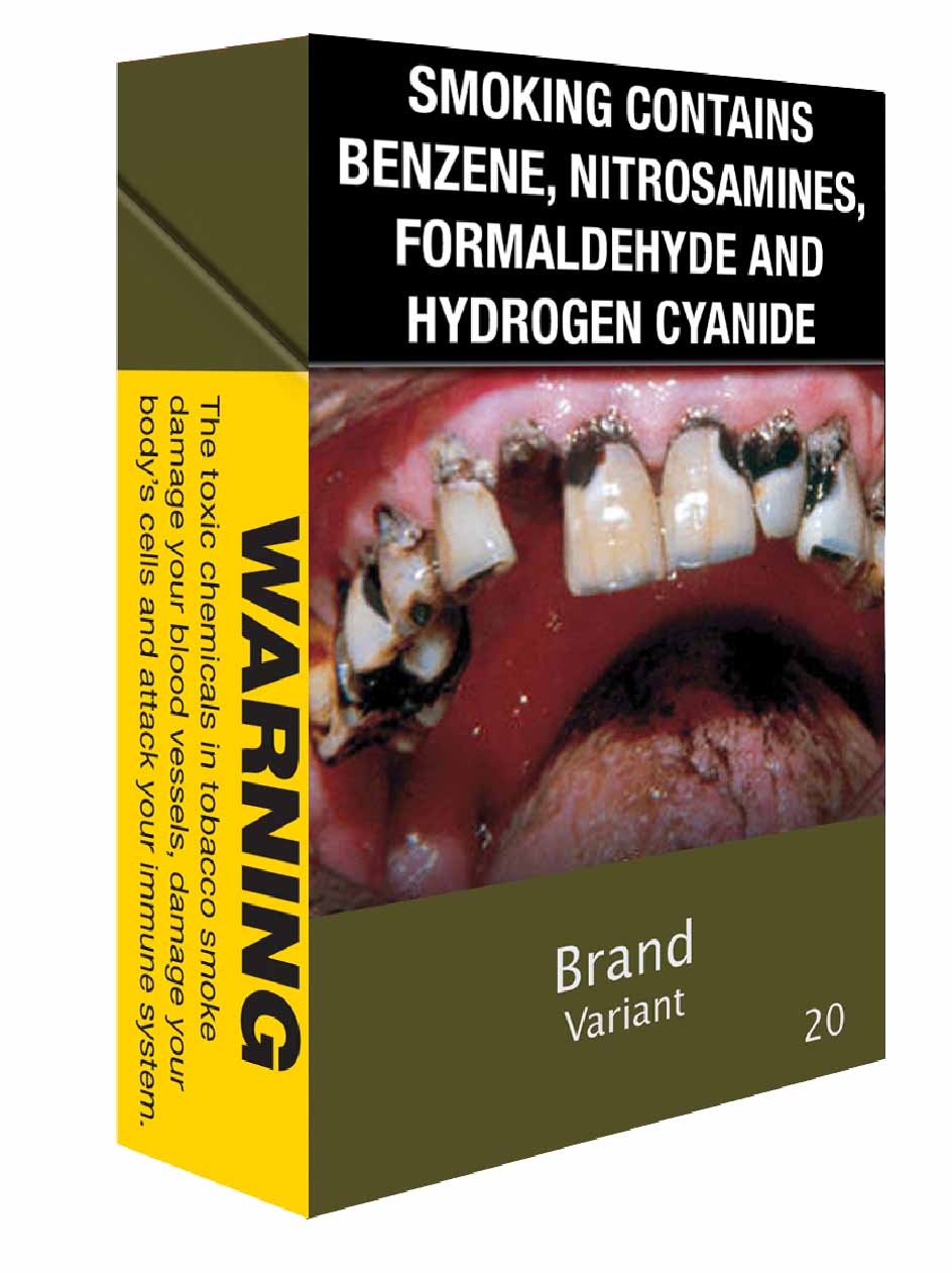
Once again, the secret lies in the pairing. To judge from the illustrations, it looks like Lucida Sans will be accompanied by at least three different styles of some Helvetica-like sans serif. And that is an ugly combination.
--
If you’d like to read more about this, I found some interesting reflections on the story – and a couple of intriguing alternatives to the package design – here: http://www.weareasilia.com/blog/focusing-unattractive
http://www.creativereview.co.uk/cr-blog/2012/april/cigarette-packaging-australia