21 december 2013

Politiken strømliner udtrykket

”TO BE PLAYED AT MAXIMUM VOLUME”, stod der på bagsiden af David Bowies Ziggy Stardust-album. Tilsvarende burde Politiken måske forsyne sit nyligt redesignede website med instruktionen ”Bør kun ses i perfekt skærmkvalitet”. Undertegnede prøvede for eksperimentets skyld at læse Politiken.dk på mit lokale kommunebibliotek, og det var bestemt ingen visuel nydelse. Udstyret skal være tip-top, hvis ikke den ny rubrikskrifts sarte kurver skal forvandles til musetrapper.

Politikens overordnede designstrategi går ud på at strømline det formmæssige udtryk på tværs af platformene. Derfor har man slettet suffixen .dk, så sitet nu blot hedder POLITIKEN slet og ret; derfor har man droppet pastelfarverne, der skulle markere sitets forskellige sektioner, og destilleret paletten ind til sort, hvid og rød (samt en breaking news-gul); og derfor har man indført Capitolium News som universel rubrikskrift, ganske som i papiravisen.
En kort overgang var Capitolium også gjort til brødskrift, men det medførte så mange klager over læseligheden (først og fremmest fra pc-brugere, tænk at vi også har sådan nogle, kan man næsten høre dem måbe inde på Rådhuspladsen), at Georgia fik et lyncomeback i desktop-udgaven. Capitolium har derimod fået lov at beholde pladsen som brødskrift på mobilsitet, hvor den faktisk fungerer rigtig godt.


VISDOMMEN I AT KONSOLIDERE BRANDET på tværs af platformene synes indlysende, og her er typografien naturligvis et vigtigt redskab. Der er imidlertid himmelvid forskel på, hvordan den sirlige – i mine øjne temmelig impotente, men andre synes jo om den – antikvaskrift Capitolium News fremstår på papir, i et relativt roligt visuelt miljø omgivet af store grå tekstflader og masser af ”kreativ luft”, og på webforsidens virvar af annoncer, små billeder og korte henvisninger.
I desktop-udgaven er Politikens website således, indtil videre i hvert fald og stik imod hensigten, endt som lidt af et typografisk kludetæppe.
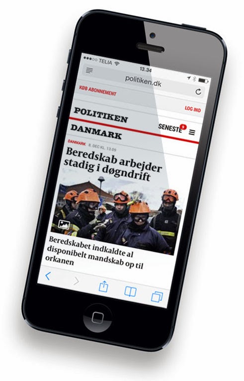
TIL GENGÆLD ER ARKITEKTUREN forenklet kraftigt. Navigationsbåndene er væk, bortset fra kundeservice i toppen, og afløst af to drop down-menuer med sektionsoversigten samt listen over de seneste nyheder. En logisk konsekvens af, at smartphones med ekspresfart er ved at overtage rollen som danskernes – og altså også Politiken-læsernes – foretrukne nyhedsplatform.
EN NY SEKTION med det forpligtende navn MAGASINET retter sig nok i højere grad mod tablet-brugerne. Her tilbydes ”langlæsning” – blandt andet artikler, der har været trykt i søndagsavisens PS-sektion – i en minimalistisk opsætning, som virker overbevisende ”politikensk” i sit udtryk. Også fordi avisen her får anledning til at eksponere sine dygtige fotografer, ligesom der gøres brug af det digitale formats muligheder for eksempelvis at inddrage videoklip.

Indtil videre er Magasinets artikelsider friholdt for annoncer; men lur mig, om ikke der ligger en plan i skuffen for, hvordan der kan kapitaliseres på dette spændende nye format, som er et lovende bud på, hvordan en stærk journalistisk tradition vil kunne transformeres til en papirløs fremtid.
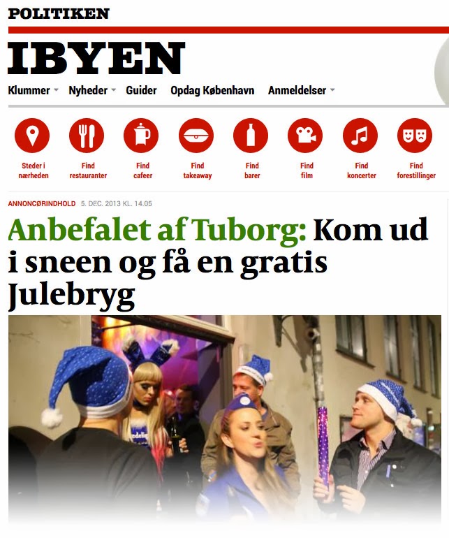
MERE KONTROVERSIELT er det måske, at man også har indført såkaldt ”sponsoreret indhold” på sitet. Såsom en ”artikel” om julebryg – med Tuborg i bylinen. Denne relancering understreger således Politikens position i danske nyhedsmediers fortrop, hvad digital omstilling gælder. På godt og ondt.

07 december 2013

A critical eye on Mandela frontpages

THE DEATH OF NELSON MANDELA was an obvious choice for yesterday’s frontpages, and art directors all over the world had to face the same challenge, quite symptomatic of the changing role of print media in a digital era: How do we communicate this story to readers who already know what happened?


Except, some seemed to think their readers didn’t know. Examples like these were mainly to be found among the evening papers – the ”real” tabloids. Not sure if this says anything about any general presumptions that publications like these might have about their audience, but it IS kind of interesting, isn’t it?


WRITING THE HEADLINE must be the hardest part. When you’re the paper of Mandela’s home town, it must be even harder. I really admire the good spirit of the Sowetan’s straightforward approach: Sure, it’s sad that our hero has passed away – but what we ought to remember, and celebrate, is the joy and hope he brought to our lives.
And for some reason, the French language makes everything – even the flattest clichés – sound, and look, better.


A NUMBER OF PAPERS chose this simple solution: Find the right portrait of the man – and with such a flamboyant figure, there must have been plenty to choose from – and just put his name and year of birth & death next to it. With a little bit of additional text, or maybe not, the whole piece will look noble, exclusive, and respectful.


Even though the communicative process can indeed become more dynamic with a photo choice that is just a tad bolder. Or a lot bolder. See how the third example, from Público of Lisbon, Portugal, suddenly adds one more dimension to the whole story and exploits the fact that Nelson Mandela’s facial features were engraved in our minds long ago. We all know what his face looked like, so here’s his fist.


FINALLY, THREE PAPERS – all from London, England – that took their frontpage one step further. The Independent chose a no-headline solution; Mandela’s face, and his words on freedom, say it all (in its later edition, The Guardian took a similar approach). The Times expanded its frontpage into a full cover and made intelligent use of the tricky format.

But the boldest move was the one of Metro – a freesheet which you might have expected to deliver its message as crudely and in-your-face as the traditional tabloids. Not only did the editor refrain entirely from adding words to Mandela’s portrait but the entire frontpage, including the nameplate (usually blue), had turned black-and-white. A symbolism which becomes so much stronger than in the previous B&W examples because no words are here to distract my attention.

11 november 2013

A beautiful beast with a complicated life


THE LAUNCH OF THE DAILY BEAST, 6 October 2008, must be a textbook example of bad timing. Media mogul Barry Diller’s ambition was to revolutionize how news and, not least, advertising were presented on the web. But his news- and blogsite aired exactly three weeks after the Lehman Brothers collapse which triggered a financial crisis that would send shock waves deep into the media industry and, for some time, shatter its economic foundation by bringing advertisers to their knees.

The fact that the Beast – named after a fictional tabloid paper in Evelyn Waugh’s novel Scoop – has managed to survive long enough to now celebrate its five-year anniversary probably has a lot to do with the stubbornness of its publisher. While the main competitor, The Huffington Post, seems to be cruising down the lane of success, The Daily Beast has had its share of problems. Six million monthly unique visitors may sound impressive, but at HuffPost, they can multiply that figure with twelve. A failed, and recently ended, marriage with Newsweek led an operating loss of $44.8 million in 2012, and recently, two dozen staffers were laid off, leaving the Beast with roughly 65 employees – about the same number it launched with in 2008.

ON THE OTHER HAND, the design has gained wide recognition and won first prize in the News category of the Webby Awards in both 2012 and 2013. Partly because of the Beast’s distinctive frontpage with the signature column The Cheat Sheet – a sharp and uncompromising take at the curator’s role which is how many people see the news editor of the future. Another reason is the site’s simple and consistent architecture which has undergone only minor adjustments, editorial as well as design-wise, compared to the concept thought out by Diller and his superstar editor Tina Brown – with the help from design company Code and Theory – in 2008.


Technically, they were ahead of their time. Typography on the web was subject to a lot more limitations five years ago than now. The contrastful and refined type of the Daily Beast frontpage stood out. And the sharp, vertical page structure seems to be conceived with a portrait format iPad in mind; but Apple did not present its tablet until eighteen months after the launch of The Daily Beast (and the first Android tablets only appeared in 2009).

THIS SPRING, it was announced that The Daily Beast – by that time struggling to make its chaotic relationship with Newsweek work – was in for a redesign. However, this new, responsive design went with the news magazine to its new owner (IBT Media) – and instead, the Beast would have to make do with a facelift which was rolled out 29 October.


Typical to the times, this is a simplification most of all, and the designers have done everything they could to retain the clear frontpage structure, the bold colour scheme, and the powerful typography. Still, the Beast’s strong and recognizable identity appears a bit weaker in this new ”flat” version, almost completely cleansed of shadows and effects. The design looks clean and functional but not quite as unique as it used to be.

NOW, WHEN EVEN TINA BROWN – who was not only one of the masterminds but also the public ”face” of The Daily Beast – has left for new challenges, the current attempt to relaunch might very well be Barry Diller’s final shot. The publisher promises that we haven’t yet seen it all. Well, the rest better be great or this beautiful Beast may soon become history … as yet another proof that looks isn’t everything, and certainly no guarantee of success.

24 oktober 2013

What a depressing place the world is


”FOR HELVEDE hvor er World Press Photo deprimerende”.

Even those of you who don’t read Danish might get the message? Anyway, the above was my spontaneous reaction last Saturday, after having walked through the exhibition with all the winners from this year’s World Press Photo contest. What a terribly depressing experience.
I posted the sentence on my Facebook wall and the immediate responses let me know that I might not be the only person feeling that way.

Well, the world is like that, my good friend Lars Pryds commented. To which my just-as-good colleague from the gooder-than-good old Politiken days, Helle Hellmann, responded: ”But it is also so much more … which apparently is not worth photographing”.

IN MY OPINION, they are both right. The world is indeed filled with sorrow and injustice and our media would ignore their obligations if they didn’t show that to us. But there is a limit to how much misery one can bear watching before developing kind of an immunity towards the dreary impressions, becoming ”comfortably numb” as Roger Waters once put it.
And press photographers do in fact produce other kinds of images.
Go through any issue of your daily paper, or a magazine, or a website, and you are likely to find a much more diverse, and much less dispiriting, selection of photographs than the dreadful horror parade of WPP. However, most of these pictures don’t enter photo contests, and those that do very rarely win.

At the exhibition in Politiken’s old print factory, this reality was exposed with almost brutal clearness as one exhibition wall was devoted to not-awarded (and probably not participating) photos by Politiken’s own photographers, all of them so much more life-affirming – yet far from bland or naïve – than the international winners. Like this one by Finn Frandsen, illustrating the feelings of a child whose dad just came home from war:


ONE COULD WISH that future WPP juries would try to send a message to photographers around the world that picturing cruelty and suffering is not the only path to winning awards. But I figure there may be no other way to effectively send that kind of signal than to completely refrain from awarding this kind of entries, if just for one year.

TO BE FAIR, even in the 2013 contest, there were a few positive exceptions to the gloom-prevails-rule … and not exclusively in the Sports and Nature categories which (although steroid freaks and endangered animals still appear to be judges’ darlings) serve as kind of sanctuaries where not everything is grief and anguish.


JAN GRARUP’s feature series with Somali women who insist on playing basketball under the constant threat from Al-Shabaab and other radical Islamist groups (who consider women playing sport to be un-Islamic) show glimpses of light in the bleak surroundings. These pictures are indications that there might still be hope, after all; something I know Jan is always trying to look for, even in the most desperate situations.

Yet my personal favourite is this little everyday scene from the camping holiday of a Danish family. The photographer’s own wife and kids, by the way. His name is Søren Bidstrup.

And yes, I honestly do believe it’s a coincidence that my three ”good” examples are all Danish :)


07 august 2013

Washington, we have a problem

WHEN JEFF BEZOS BOUGHT the Washington Post, speculations started whether he might be the miracle man who would manage to break the code and find out how to make money – real money, not the pittances that ”successful” web publishers such as the New York Times and, in my own country, Ekstra Bladet have been earning so far – on digital news. I doubt it. Not because Bezos isn’t a visionary businessman, but simply because the conditions have changed. The times when newspapers were able to make big money were the times when we readers did not have so much to choose from.

I CAME TO THAT CONCLUSION while wondering why the plastic bag, in which I had put all the stuff I intended to read this summer, appeared to get more, not less, full during the month of July. My plan had been to read one piece a day and I had expected the bag to be empty by August 1. It didn’t turn out quite that way and my heatwave-induced laziness was only part of the explanation. There was just so much more to read, besides the stuff in my plastic bag.

I REMEMBER THE SUMMERS of my late childhood when the newspaper would sometimes be the only thing I’d read in a day, apart from the occasional novel or Marvel comic book. One issue of Politiken could last for an hour, sometimes more. Compare that to now when dozens of e-mailed newsletters, tweets, and Facebook updates keep linking me to must-read stuff (and sometimes just fun stuff) 24/7. All of it very interesting and entertaining, and I spend lots of time going through it, but not one of this gazillion of ”publications” can ever aspire to become my chosen one, the way Politiken was forty years ago. I even forget the names of most of the sites I have visited and my list of bookmarks is so ridiculously long by now that the chances I’ll actually ever visit them again are slim.

JUST LIKE THE REAL WORLD, the media world is suffering from overpopulation. And the scarce resource is our time. I therefore believe that the only way high-quality journalism can become a sustainable product in the future is if the publisher manages to establish such an esteemed brand that we’re willing to pay for it even though we won’t actually read it that often. The New York Times is an obvious example; certain niche publications with low production costs might be able to copy the model on a smaller scale. As for all the rest: Washington, we have a problem.

24 juni 2013

Simple, but far from shallow

I’M A SUCKER FOR SIMPLE SOLUTIONS. I love it when the presentation speaks so clearly that I immediately understand what the story is about, making it easy for me to decide whether to devote some of my precious time to reading it.
But don’t you think we should leave something up to the reader’s imagination, you might argue. Sure I do, but the point is, there’s plenty to be left for the imagination even when the first visual statement is perfectly clear. Here’s a great example from yesterday’s Politiken:


THYRA FRANK is a woman who got famous in Denmark for running a nursing home where the elderly are allowed to continue living their lives as they please – smoking, drinking, and eating unhealthy food if that is what they prefer. Two years ago, Ms. Frank got elected to parliament for a new libertarian party and this article is about the fact that ever since she went into politics, she has become all but invisible in the media.
The headline says ”Has anybody seen Thyra Frank?”.

I don’t think I need to explain what the photograph (by photo editor Thomas Borberg) says – if I did, it wouldn’t be so clear and simple, would it?
But I can tell you that the scene is one of the corridors of the Danish Parliament.
Have a closer look:


WHAT I LOVE ABOUT THIS PAGE is the perfect interrelation between headline and photo. Has anybody seen Thyra Frank? Yes, I have, the reader will respond … but it looks like she is hiding. With a smile on her face, as if there might be some secret reason for her concealment. Maybe something we’ll understand if we read Olav Hergel’s article?
In fact, that’s exactly what we will – which sort of closes the circle, making this an ideal example of journalism as it should be practiced in 2013.

AND IT’S NOT ROCKET SCIENCE. All it takes – besides a great journalist and an interesting topic – is a photographer who 1) knows and understands the point of the story, 2) has a talent for visual journalism, and 3) puts the reader’s experience above personal prestige and esteem among colleagues.

Sadly enough, none of the above are self-evident.
At a reception the other day, I spoke to a well-known Danish free-lance photographer and took the liberty to comment on some of his pictures, criticizing them because I think he often prioritizes the artistic expression, and his personal style, rather than worrying about the communication.
”How do you think the readers interpret your photographs?” I asked him.
”The readers?? Nothing could interest me less”, was his bold answer. ”Editors hire me because they expect something special … and that is what I deliver, regardless of the story and the audience”.

THIS GUY IS THE MARIO BALOTELLI of Danish press photography. For people like him, the most important thing is not to deliver true quality – who cares about that? – but to be seen, to become a brand.
Shallowness characterizes a big part of the media industry, and a lot of celebrities – whether in showbusiness, football, or press photography – seem to have ”being noticed” as their top priority.
However, the Politiken page which inspired me to write this blogpost is anything but shallow. Simple, yes … but at the same time, much more profound than all the artsy-fartsy stuff that fills today’s media, and which may look so deep but is in fact mostly glitter.

PS: Just like what is being told about the real Mario Balotelli, this photographer whom I met at the reception turned out to be a really nice bloke :)

19 juni 2013

You say it best … when you say nothing at all

I HAVE ALWAYS BEEN INTRIGUED by the title of this song which became a major hit thanks to Notting Hill. I’m sure it’s all about love and devotion, just like the movie, but you don’t need to be much of a male chauvinist pig to interpret it in a more sexist way. In any case, the theme is non-verbal communication and that is why I came to think of it when looking at two wonderful magazine cover illustrations.

Instead of following the usual path for magazine covers and combine visuals and words, the standard procedure for a New Yorker cover is to rely on the visual element alone, with no accompanying headline. This shows great trust in the power of non-verbal communication. On a New Yorker front page, the illustration by itself has to convey the message so clearly that no words will be needed. I find this approach really bold and inspiring, but does it work?

First, let’s have a look at the two covers. One relates to last year’s U.S. presidential election campaign (the issue is from October 15, 2012) and the other one is a comment on a new citibike initiative in New York City.


THE NARRATIVE TECHNIQUES of the two illustrations are not the same.
The one to the left, created by Barry Blitt, is almost like a secret code. You won’t understand it unless you know two things. One, that Mitt Romney won the first TV debate with Barack Obama by such a wide margin that the president might as well not have participated. And the other thing you need to know is that Clint Eastwood was a speaker at the Republican National Convention 31 August 2012, and as a rhetorical device, he chose to address a chair on the stage, pretending that it was president Obama.

So first, ”a chair” has been established as a metaphor for Barack Obama, and secondly – even though the artist might not agree with that metaphor or sympathize with Eastwood’s convention stunt (very few people did) – he uses it to illustrate how disappointed he is with the president’s debate performance five weeks later. This is very witty, I think. But it’s also pretty demanding. The New Yorker expects a lot from its audience.

WITH THE CITIBIKE COVER, you don’t need lots of factual knowledge to understand the illustration. It might help if you have heard of the New York citibike initiative but even if you have not, you will still roughly understand what the story is about (and be a lot wiser once you have read the article inside. At least that is my presumption … I only know these two illustrations from the web).

Still, the cover puzzled me. Like the majority of those who used the New Yorker’s Facebook page to comment on the illustration, I saw it as ironic, the message being: It would be better if people got their exercise when riding through town on a city bike than by sweating in a gym.
But the funny thing about images as communicators is that even when a visual message seems crystal clear to you, another person might interpret the same image in a completely different way. According to Connie Malamed who wrote Visual Language for Designers, studies show that people frequently misinterpret images – that is, understanding the message of the image differently than what was intended.

The citibike illustration was probably conceived to be ironic (even though the artist, Marcellus Hall, did not mention this when interviewed about his illustration). But we cannot know for sure – maybe Hall was just imagining a funny situation – and, more importantly, does the potential irony reflect the coverage inside the magazine? My guess is it does not.

UNDER NORMAL CIRCUMSTANCES, I would regard it a huge weakness for an illustration to be biased in a different direction than the story it is supposed to illustrate. In previous blogposts (here’s one example), I have criticized such cases because of the obvious risk that readers will get confused, disorientated, even misled.
I guess The New Yorker is the exception that proves the rule.
Readers of this magazine have gotten used to covers that do not qualify or substantitate the story but should be rather seen as a ”second opinion”, as an artist’s independent point of view on the topic, sometimes even contradicting the words inside the magazine. Most likely, the same readers appreciate this communicative strategy and look forward to see ”what they have come up with this week”.

The reason why it works? There are three, I think. One is habit. I once heard a jazz drummer explain that ”if I make a mistake, I’ll make sure to repeat it a couple of times. That way, it will no longer be a mistake; I have simply invented a new figure”.
If you show consistency in the way you communicate, just about anything may work.
The other reason is that the audience of The New Yorker are not your average magazine readers but quite upmarket and intellectual. For titles such as Tattoo Magazine or Hot Rod, the approach might not be recommendable.
And last, but not least, it works simply because The New Yorker uses such great illustrators. Every week of the year.

23 maj 2013

Form over function?


EVERY TIME I SEE DAGENS NYHETER, I enjoy the paper’s new look which has been recognized in several design competitions and which earned Sweden’s leading morning daily a well-deserved place among the World’s Best-Designed Newspapers. Whether on print or tablet, DN appears to have found a form which matches its high-quality contents perfectly.

With one exception.
DN’s infographics are suffering from a severe case of circulitis.

I can understand how tempting it must have been to promote the DN punkt – the full stop sign which has distinguished Dagens Nyheter’s nameplate ever since the newspaper was founded in 1864 – to a key element of the new design. And in many instances, this works fine:


WHEN IT COMES TO CHARTS AND DIAGRAMS, however, DN’s fascination with the circular shape has taken them too far.
As a means for representing data, a circle has got limited potential. Divide the circle into components, like the slices of a pie, and we can roughly estimate how these different slices relate to each other (for that purpose, we use our experience from looking at a clock) … but when it comes to judging the actual size of a circle, most of us have to give up.

Try it yourself: How much bigger than circle A is circle B?
The problem is, we don’t know the ”rules”. Contrary to a bar chart, where the convention dictates that only one dimension matters – the height of a column, the length of a bar – no one has taught us how the size of a circle should translate into numbers. Do they want us to compare the area of circle A to circle B, or perhaps the diameter?
The difference is significant. The diameter of circle B is three times bigger than that of A; the area is nine times bigger!

A relation which becomes much easier to see if bars are used instead of circles:


When using circles to represent size, one will have to add the actual values to help readers get the message. And then, you might ask, what’s the point of making the graphic?

EXPERIMENTING AND LOOKING FOR NEW WAYS TO VISUALIZE DATA should be encouraged, and I guess it’s natural for fashion to change on the infographics scene as well as elsewhere. Currently, circles are en vogue. But using circles where a different shape – e g bars – would be appropriate is the equivalent of writing with distorted letters that nobody are able to read. Infographics is a kind of language, and you cannot replace one linguistic component with another just because you think the new one looks more interesting, or fits better into your design concept. Not if you wish to be understood.

Have a look at these graphics from recent issues of Dagens Nyheter and see how little information they convey to the reader. If an exact value had not been written in each circle, the graphics would have been impossible to decipher. And with the use of conventional bar or pie charts, all these examples would have delivered the message much more clearly and instantaneously:


FUNCTION IS BEING SACRIFICED on the altar of form. How strange to see this happen in a publication with such a rich infographic history and one of Scandinavia’s finest graphic departments. Moreover, the recent – otherwise very successful – redesign is in fact the brainchild of an infographic expert!
Rickard Frank started out as a graphic reporter at Svenska Dagbladet and has given infographics top priority at all the papers he has been able to influence through consulting or in various managing positions.
Therefore, I simply don’t understand why Rickard allows his own paper to consistently under-inform just for the sake of style.
Please, kill this darling! Now!

PS: In his wonderful book The Functional Art, Alberto Cairo dissects the phenomenon which he has named ”the bubble plague” (and even manages to come up with a few cases where it makes sense to use the so-called ”bubble chart”).

13 maj 2013

Great news from the global kiosk

THREE YEARS CAN BE A LONG TIME. On April 3, 2010, the Apple iPad was released – and wow, what a breathtaking development the app market has undergone since then. To a news junkie, a very fascinating aspect is that it has become so easy to go shopping in the ”global kiosk”. The App Store business model may not deserve recognition for its fairness but from a customer’s point of view, it’s a winner.
Try downloading a couple of issues of LaPresse+ (it is free) or the iPad version of Dagens Nyheter (price 19 DKK) – just to name a few examples – and enjoy the quality of these publications, design-wise as well as regarding content. To newspapers and magazines with more limited budgets, like those published in my own country which only five million people will ever be able to read, this is pretty harsh competition.


The new app from the weekly magazine New York caught my attention a couple of weeks ago and is certainly worth a look. Not least because it challenges a couple of tablet format guidelines which had already more or less become conventions.

NEW YORK was founded in 1968 by Milton Glaser and Clay Felker. It was conceived to be an unorthodox competitor to the well-established The New Yorker and soon became a cradle for new journalism. Over the years, such notable writers as Nora Ephron and Tom Wolfe have contributed to the magazine. A tablet edition has existed since October 2010 but this new app is a completely revamped version.

What impresses me most with the New York app is its bold and original approach to solving the dilemma between linear and non-linear publishing. Everybody knows that the contents of a digital publication can be updated every second, contrary to a printed publication which is by definition static and basically must have a linear narrative pattern. Consequently, in a digital environment, users may find it strange if nothing is happening for twenty-four hours (not to mention seven days).

On the other hand, if the contents are constantly changing, it can make you feel like you are never ”done”. Many readers appreciate volumes that have a beginning and an end. As Mario Garcia wrote recently in a comment to the new desktop app from The Economist: ”Readers want to read news editions that come to an end”.

So here we have a dilemma. And trying to combine the two types of publishing can lead to confusing results, as I described last year in my review of the first version of the Berlingske app.


THE NEW YORK SOLUTION is solomonic. The magazine has simply split the opening page in two and introduced a ”slider” which the user can draw up or down in order to switch between the magazine and an iPad-adapted version of the nymag.com news updates.
At first glance, this looks as strange as it sounds. However, as the entire app design is corresponding very elegantly to this ”two-face” architecture, it didn’t take me long to get used to the concept. In fact, I think it is pretty smart, rather than odd.

Another bold New York move is the decision to refrain from landscape mode. If you rotate your tablet 90 degrees, a small icon will appear on the screen which simply tells you to return to portrait mode.
Now wouldn’t it be great for all the magazine designers of the world if it might become standard procedure to make this basic choice – either it’s horizontal format, or vertical – instead of always having to offer users both options … with all the practical drawbacks, and very few actual benefits, this freedom-of-choice gives them?

THE FACT THAT NEW YORK CHOSE PORTRAIT MODE indicates that its editors must value words higher than visuals, because it cannot be denied that photography loses impact.
The overall visual appearance of this app is very concincing, though, with only one small minus for the body text which looks a little crabbed on my iPad 2. But perhaps it works better on a Retina display?


An ice blue colour marks everything that has to do with navigation and multimedia (mainly audio), meaning that users will quickly learn how to work the new app and enjoy its contents – which are impressive, in quantity as well as quality. To those who plan to visit the Big Apple, this is a must-read. And to the rest of us, it is definitely worth a look.

03 maj 2013

A drawing style is like a tone of voice

”THESE ARE DRAWINGS NOT PHOTOS. WHATS THE PROBLEM?”

Just one of many users’ comments from Huffington Post to the current debate on a controversial magazine cover illustration. To be fair, THE WEEK run a caricature on almost every single front page they publish; therefore, frequent readers of the magazine must be used to this drawing style and might not see this particular front page as being quite as offensive as some other people – including this blogger – do.

Anyway, what intrigues me is not so much the discussion on potential racism and the fact that the artist depicted the Tsarnaev brothers less ”white” than they actually are. Although this is indeed interesting, and probably says a lot about the American society. Two rather good-looking young men (one slightly handsomer than the other) have been portrayed as jowly, gloomy-faced frights. And the one thing upsetting us is that their skin was made a tad darker than it actually is.


BUT THERE’S ANOTHER PROBLEM. And that is the impression people – a majority of Huffington Post users, at least (or, rather, a majority of those who commented on the story) – seem to have of illustrations. They appear to think that if it’s a drawing, anything goes. If you are an artist, you can do whatever you please.
Now of course cartoonists should enjoy great freedom. They must have the liberty to portray Dimitri Medvedev as a puppet – and even Angela Merkel as a nazi officer (although I personally find that analogy inappropriate) – in order to criticize not so much the appearances of these men and women, as their actions.

But what some people may not realize is how much is communicated through the drawing style.
A drawing style is like a ”tone of voice” with which an artist can add nuances to a visual statement and imply how that statement should be interpreted.

The more grotesque a picture looks, the more obvious it will be to the viewer that its statement should not be taken literally.
And once we realize that it is not to be taken literally, we’ll start looking for more layers, searching for an underlying message of the illustration. A subtler message, often kind of symbolic, often using metaphors.

AS I SEE IT, the main problem with the cover illustration of the Tsarnaev brothers is that there are no hidden layers to be found. This drawing does not ask to be scrutinized, it contains nothing more than what you see at first glance.
And its message is plain and simple: ”Here’s what these two guys look like, see what kind of monsters they are”.
This drawing is pure propaganda. It wants to manipulate us into seeing two Chechen immigrants as the essence of evil.


In a way, that is kind of strange, as the headline – and the subhead in particular – suggests a depth and a willingness to try digging down into the true substance of the story which could have been accompanied much more convincingly by a different kind of images. Pictures implying that these two men may be human after all, not just monsters, in spite of their horrible deed.

I have not read the article. But I suspect that the choice of illustration might be due to poor judgment and lack of skill rather than bad intentions.
But that is another story.

Thanks to Hari Stephen Kumar for composing the above picture package.

23 april 2013

Gratisavis efter schweizisk recept


NULLERNE VAR DET ÅRTI, hvor den danske ungdom læste avis. Med MetroXPress som spydspids lykkedes det gratisaviserne at nå to befolkningsgrupper, der ellers havde glimret ved deres fravær i læserstatistikkerne: Folk med indvandrerbaggrund – og dem under 30.

I de senere år er der imidlertid blevet længere mellem avislæserne i tog og busser, og især de unge dropper i stigende grad papirmediet til fordel for smartphones. Det skal der laves om på, mener schweiziske Tamedia, der købte MetroXPress kort før jul og fire måneder senere relancerede avisen på både papir og web … efter samme opskrift, som har givet koncernens gratisavis 20 Minuten succes på hjemmebane.


DET MED OPSKRIFTEN skal tages bogstaveligt. MetroXPress ser nu ud nøjagtig ligesom 20 Minuten, der er kun sprog og logo til forskel. Til gengæld er der absolut intet tilbage af det ”gamle” MetroXPress – lige bortset fra en chefredaktør og en gruppe medarbejdere, for hvem det må føles en smule sært at skulle levere et radikalt anderledes produkt end det, der trods alt var et af Danmarks mest læste dagblade, da de gik på påskeferie.

På indholdssiden ses det, at sigtekornet nu er rettet mod et yngre publikum. Natteliv, kendte, dyr og underholdning fylder godt i spalterne, ligesom der synes at være et øget fokus på sex; måske på baggrund af de erfaringer, den ny chefredaktør-nummer-to Niels Pinborg har taget med sig fra Ekstra Bladet.


DERIMOD VIRKER AVISENS DESIGN bestemt ikke ungdommeligt. Siderne er fattige på kontraster. Citater og faktabokse optræder yderst sparsomt, ikke engang mellemrubrikker er der til at peppe den store mængde grå brødtekst op. Og skriftvalget kunne næppe være mere traditionelt; kun ”skrivemaskineskriften” Jubilant skiller sig ud i den ellers helt neutrale typografi. Det er sådan set ikke grimt, det virker bare mærkeligt, at man ikke forsøger sig med noget lidt mere funky.

Det eneste, som med lidt god vilje kan kaldes moderne, er det ny handy format, der syd for grænsen er kendt som ”halvberliner” og benyttes af blandt andet Hamburger Morgenpost. Lille, men dog tilstrækkelig stort til, at tryksagen opleves som en avis. Det trækker imidlertid fra, om ikke andet så i miljøregnskabet, at formatet her i landet kun kan produceres ved at trykke en tabloidavis og skære en trediedel af papiret væk.


EN ØGET SATSNING PÅ NETTET er udtryk for, at læsermigrationen mod digitale platforme bliver taget alvorligt. I lyset heraf må det undre, at de to udgivelseskanaler slet ikke er tænkt ind i et fælles visuelt univers. Kun det blå logo – der både på print og web fremstår undseligt og karakterløst – antyder, at mx.dk er i familie med papiravisen.
Det meget enkelt opbyggede site synes i øvrigt designet til smartphonens lille skærm, hvor det fungerer ganske fortrinligt. Formen er dog ikke responsiv; mit gæt på en forklaring er, at såvel web- som printdesign sikkert har nogle år på bagen.

Nå, indtil videre er det naturligvis papiravisen, indtægterne skal komme fra. Og hvis den virkelig hitter blandt teenagere i Schweiz, må der være større forskel på de to landes ungdom, end jeg gik og forestillede mig. Man skal være varsom med at lege profet; men undertegnede vil ikke blive overrasket, hvis MetroXPress med sit ny indhold kommer til at vinke farvel til en del af sine mere modne læsere. Uden at få held med at løfte læsningen substantielt blandt de unge, som man så gerne vil have fat i.