07 maj 2012

Tabloid? Yes please, ASAP

NEXT SATURDAY, the Danish morning paper Politiken is going to close down a couple of its broadsheet sections and open some new ones in tabloid format.
To a normal newspaper, in 2012, this would be no big deal, except perhaps rather late for such a move. But to a publication which has, during the last couple of years, been nominated World’s Best-Designed Newspaper, European Newspaper of the Year, and brought home truckloads of SND and SNDS diplomas – almost always with jurys mentioning the Politiken designers’ skillful use of the broadsheet format as a unique quality – this step is quite a significant one.
After making some experiments with the format and having to accept the fact that Danish print facilities are turning any idea of a berliner-sized newspaper, like The Guardian, into an impossible dream, the late editor-in-chief Tøger Seidenfaden had drawn the conclusion that tabloid would be wrong for a paper like Politiken. Now with a new person behind the wheel, the smaller format starts looking like an option once again, and I can’t wait for it to happen.

WHY IS THAT? As a visually oriented person, I guess I am supposed to love Politiken and the way photos and illustrations are exposed on its big, big, big pages. And I do indeed love Politiken. It is a love affair that started in the mid-sixties and grew only stronger during the years around 1990 when I had the pleasure and great privilege of working at the paper myself. Politiken has got world-class illustrators, world-class photographers, and world-class page designers. And the visual staff is highly appreciated by the management as one of the paper’s key assets, and constantly encouraged to explore the possibilities and try out new ideas.
For instance, look at this great front page from last Friday, promoting a special supplement on music festivals:


NEVERTHELESS, I have the impression that all this visual hype has gone too far. In earlier blogposts, I wrote about what I see as the lack of a critical eye in the editorial department when it comes to Politiken’s use of photographs. Another observation I have made is that ever more frequently, I choose to read the Politiken e-paper on my iPad instead of the paper version, partly because it is more handy but just as much because every broadsheet page does in fact contain so little information that I can easily overview it on the 241x186 mm screen.
Yesterday, once again I sat there with the feeling that an awful lot of paper had been wasted.
The front of the Sunday B-section looked like this:


THIS FRONT PAGE promotes a two-page interview with Danish actress, author, artist, film director, etc, Anne-Grethe Bjarup Riis.
It is an interesting interview, portraying an interesting person. As the headline suggests (both headlines do, in fact), she possesses an intriguing dualism, graceful lady and outspoken provocateur at the same time.
Lars Just’s photographs of her are beautiful and everybody in Denmark loves the sight of anemones as this flower signals the start of our favourite time of the year.
However, when I asked my wife, who had already read the article, what she had thought of the photos, she answered: ”To be honest, I did not notice them”.


IN MY EYES, this is a complete communicative failure. Altogether, we are talking close to half a square meter of color photography and its task is indisputable: Give Politiken’s readers a visual impression of a controversial, many-faceted person.
Instead, I get anemones.

NOW LOOK what might have happened to the communicative totality if the second photo had looked like this:


OR, even more provocative and, as such, expressing the very point of the story (the headline says, roughly, ”A graceful lady who refuses to keep her mouth shut”):


THE SELF-PORTRAIT TO THE RIGHT is titled Ordinary Hooker with Career Spoiler and was Bjarup Riis’ contribution to the Charlottenborg Art Exhibition 2006, a comment on the exploitation of women. Both the subject and the photograph are being thoroughly discussed in the interview.
If yesterday’s story had been presented in such a way, I am pretty sure my wife would have noticed. Moreover, this would have been a much more congenial visual representation of the interview. But of course, there is an infinite number of ”right” solutions, not just these two stitched together by me in a couple of minutes.

MY CONCLUSION? Politiken appears to be resting on its laurels, assuming that every big photo is a good photo, and all too often allowing its photographers to run free-style without paying any attention to the story. Shrinking the format will force everyone at the paper to consider much more critically what to print and what to frame and use for decorating the walls. As I just mentioned, I can’t wait for that to happen.

06 marts 2012

The colour of money

COLOUR IS THE STRONGEST VISUAL ELEMENT OF A BRAND. Think of Santa Claus. The character you will be imagining might look different from the way I see Father Christmas, but I am positive that our two guys have one thing in common: They will both be dressed in red.
Maybe you know that Santa’s looks and red uniform can be traced back to a 1931 Coca-Cola ad? Before then, the bloke could be of any weight class and wear all kinds of clothes.
So here’s one more thing that could never be anything but red (and white): Coke.

But then what happens if different colour identities get on a collision course?

See for yourself:


THIS IS LA BOMBONERA, the legendary home ground of Argentinian soccer team Boca Juniors.
It is also one of the very few places in the world where Coca-Cola had to accept substituting their trademark red with a dull black.
Why?
Because the archrivals of Boca Juniors, River Plate, are playing in red and white. And there’s no way the Boca Juniors fans would ever allow that particular colour combination inside their stadium, except on the jerseys of their opponents.
That is how much colour means.

IN CASE YOU’RE SKEPTICAL, take a look at the conclusions of a 2009 study carried out by patent and trademark attorneys Withers & Rogers. 64% of the respondents rated colour more important to a brand than slogan, typeface or logo shape. And the survey mentions several examples of companies fighting for the ownership to a particular colour, like Cadbury’s legal dispute for more than five years with an Australian confectioner over the rights to use the colour purple.

THE IMPORTANCE OF COLOUR struck me last week when surfing the internet and spending a couple of minutes checking out Danish newspaper websites. Now these publications spend millions every year on maintaining and reinforcing their own brand recognition through campaigns, stationery, signage, etc. And each of them has its own signature colour.
Politiken is red, Jyllands-Posten is green, and Berlingske is blue.

So how come they all seem to completely forget about this when selling ad space on the internet?


OF COURSE I KNOW THE ANSWER. And so do you. It is all about dough. For ten years or more, newspapers have been panicking over the dire prospects of how to make money as advertising would leave print in favour of the internet.
This panic leads them to quite an irrational behaviour. Instead of thinking long-term and concentrating on establishing their precious, credible, centuries-old brands just as solidly on the internet as they have managed to do on print, it looks like they worry most about the upcoming annual accounts.
No doubt Irma, Handewitt Scandinavian Park, and Sydbank pay well for the privilege of taking over the websites of the three leading Danish morning papers for a while. The comparison that comes to my mind, however, is three noble old ladies dressed up as whores.

SOME NEWSPAPERS CHOOSE DIFFERENT STRATEGIES, and I am not only referring to high-brow publications such as The Guardian or The New York Times.
For instance, here’s the Daily Mail – which may have been inspired by Google: Become number one and then you can define the rules. Indeed, the 19 million GBP of online advertising revenue brought in by Mail Online last year seems like petty cash when compared to the 340 million the newspaper made on print ads, but still, it represents a 65% growth over one year. And the 45+ million monthly users ought to make this site interesting to advertisers even though they will not be allowed to dominate the front page. See the flat white box up in the corner, right below the dateline? Yep, that’s the ad.


24 februar 2012

Photographs that ”lie”: A silly debate

HERE YOU SEE THE WORLD’S BEST PORTRAIT PHOTO, taken by a Danish student of photo journalism. Congratulations to Lærke Posselt who saw how there might be a story-telling potential in the way the wind was blowing Iranian-born actress Mellica Mehraban’s hair in front of her face during their 10-minute encounter. This adds so much to the picture, and at the same time, exactly what it is adding is impossible to express with words. Which is precisely why it is such a great picture.


THE WPP AND POY AWARDS came in just the right moment to swirl this portrait into a heated debate which had been ignited – for the umpteenth time – by a third contest. In January, a jury assembled to award the Danish Press Photo of the Year. Photographer Thomas Nielsen’s entries to the contest were refused because the jury decided they were leaving out important details, and therefore did not convey a correct representation of what had been in front of the camera.
When shooting the photos at Mændenes Hjem, a place for homeless men in Copenhagen, Thomas had been using a ”snoot” – a cardboard tube at the end of his flash which created a narrowly focused light on the subject. Some members of the jury keep insisting that the shadowy parts of the photos must have been further darkened in Photoshop and that the photoshopping was the main reason for denying Thomas the chance to participate.
As if that was important.
As if there was a meaningful way to define ”manipulated photos” – and to make a distinction between those and the rest … which would, in that case, have to be ”non-manipulated” photos.

ACCORDING TO DANISH EXPERTS on press photography, the restrictions on what is ”allowed” with Photoshop are even tougher internationally than in Denmark. Nevertheless, Lærke’s photo, which must have been shadowed even more than Thomas’ – it was taken in Gothersgade, Copenhagen, in broad daylight – managed to win not just one, but two international awards, and deservedly so. But how could you ever argue that this portrait has not been manipulated?

Now let us, for a little while, leave Photoshop out of the discussion. To me, the only important ”manipulation” in this photograph concerns the hair in front of Mellica’s face. That is what makes this photo great, in the sense that it adds meaning to the portrait, turning it into something more than just a rendering of the actress’ facial features.
The fact that this ”manipulation” was a joint effort between the wind and Lærke’s talent does not make the photo one bit less manipulated.
On the contrary, it is the manipulation that makes the photo true.

PHOTOGRAPHS ARE MANIPULATIONS BY NATURE. When you choose to focus on part of what you see and omit the rest, you manipulate. Whether the editing is made before or after the photo is taken, and whether it is done with a snoot, or with a scalpel and some retouching skills, or with Photoshop, is of little relevance if what you are searching for is ”the truth”.
An example which became famous but not so much because of what it omits, is Eddie Adams’ 1968 photo of the execution of a Vietcong soldier. The version to the left is the one we all remember, but the original – to the right – is much more complex and turns the story of the execution into a more nuanced one. Both stories may be ”true”, but they are not the same story.


ON THE OTHER HAND, you can ”lie” just as much with a photograph that plays by every rule of the average press photography contest, as you can by ”manipulating”, if this means adding or removing pixels or whatever was decided in some arbitrary definition.

In a couple of last year’s blogposts, I showed some examples, like Martin Bubandt’s photos of Icelandic publisher Snæbjörn Arngrímsson which portray a kind, gentle man as if he were a hybrid between Action Man and count Dracula. Just to recapitulate, here is one of Martin’s photos, to compare with what Snæbjörn looks like in real life:


AS I HAPPEN TO KNOW Snæbjörn (I even took the amateurish photo to the right), I also know for a fact that Martin’s photos are ”lying”. They give the readers of Børsen Pleasure a totally false impression of the man they were supposed to portray.
However, according to the ”rules”, they are not ”manipulated”. 
(By the way, it made me happy to see that Martin himself is well aware of the implications of his own photographic style. In one of the discussions among Danish photographers and other media people which followed the Thomas Nielsen incident, Martin Bubandt is quoted to have said: ”If I had been the photographer working at Mændenes Hjem, I would have brought my two generators and put spotlights on everything. Then you would be able to see everything going on there. But that would have been a personal style just as much as Thomas’ use of the snoot. So what’s the difference?”)

I’LL TRY TO DRAW A CONCLUSION. It is simple but it is not easy, as Danish footballer Michael Laudrup responded when journalists were wondering how his sophisticated game could look so simple:

Whether a photo tells the truth or not is partly a question of the photographer’s honesty. But most of all, it depends on his or her own ability to see what is true. Sometimes, that may take years of research and contemplation. In other cases, as in Lærke’s, it is a matter of talent and luck.
And no matter how many rules you try to establish for that, you will never succeed.

14 februar 2012

A never-ending newspaper

25 JANUARY 2012, the Danish newspaper Berlingske Tidende launched a new iPad app, accompanied by a lot of marketing buzzwords. ”The only serious challenger to the printed newspaper” and ”and ambitious app which ties together all of Berlingske in one playful and innovative universe” … those were some of the words with which the publisher presented the new app.


AMBITIOUS IS INDEED A FITTING DESCRIPTION. ”Berlingske for iPad” was developed with far more than the circ 100,000 Copenhagen newspaper in mind; the plan is to use it as a prototype for tablet apps within the entire Mecom corporation. And it was not conceived to be just the electronic version of your printed paper – it combines print and web. Throughout the day, the app is updated with news from the Berlingske website, and around midnight, the contents of the morning paper will be added to the publication.

Appealing as it may sound, this concept has a built-in conflict. The linear structure of the app, with a frontpage (actually you’ll get five different frontpages, something to which I shall come back) and a number of sections, suggests that it should be read from the beginning to the end – following the ever more prevalent tablet reading pattern: Swipe down to finish the story, swipe right to carry on to the next one. However, as stories are being swapped all the time, you will never really feel that you are ”done”. Moreover, you might lose track of which stories you have read and which ones you haven’t.


THE DESIGN DOES NOT REALLY HELP. The app presents itself as one long series of only subtly prioritized refers, consisting of a short headline plus (in most cases) a small photograph half-hidden by the headline and its shaded background. This means you’ll often have to guess what the story is about. There are no subheads to help you, no information of whether this is a news article, a column, an analysis, or whatever; nothing to signal if it is a short or a long text; and the type size of topic & date is so small only very sharp-sighted people will have a chance to read it.

In many ways, the new app feels like a beta version. News transferral from the website is pretty clunky: Lots of stories come with only a headline and a picture, or a headline and an intro. Only one line of text is allocated for captions, and as they are often longer, readers will have to imagine the last part. Bylines are blue which makes them look like links, which they are not. There is no place for comments, no social functions, and no search field.


BERLINGSKE FOR iPAD does have a number of interesting personalization options which could be the strongest reason for choosing this way to enter the Berlingske universe.
First of all, the user gets five frontpage alternatives to choose from, such as ”News overview”, ”My frontpage”, etc.
Besides that, tags can be ”plussed” if you wish to see how your favourite stories develop or if there is any news on your chosen topics (unfortunately, here’s one more feature which appears to be very beta; to make it genuinely useful, tagging will have to be done much more consistently).
Finally, you can influence the page hierarchy and, to some extent, decide which topics get top priority. To operate this, you push buttons that vibrate just like iPad icons – but which look more like the plastic buttons on a toy phone and can be dragged to the strangest places, even out of the screen.


HERE, AS WELL AS IN THE PAGE ARCHITECTURE (with navigation elements distributed across the screen in a slightly disorganized way), I miss the ”neatness” which we have learned to expect from the iPad format. On the other hand, the app is clearly a member of the Berlingske ”family”, with typography and colour quite similar to the web and print editions.


To Berlingske subscribers, access is free. New users will have to pay 299 DKK (40 euro) a month after a 30-day trial period. As the vast majority of the contents of this app comes from Berlingske’s website, the price policy might be a forewarning of a B.dk paywall in the not-so-distant future.

05 december 2011

The newspaper as a shelving system

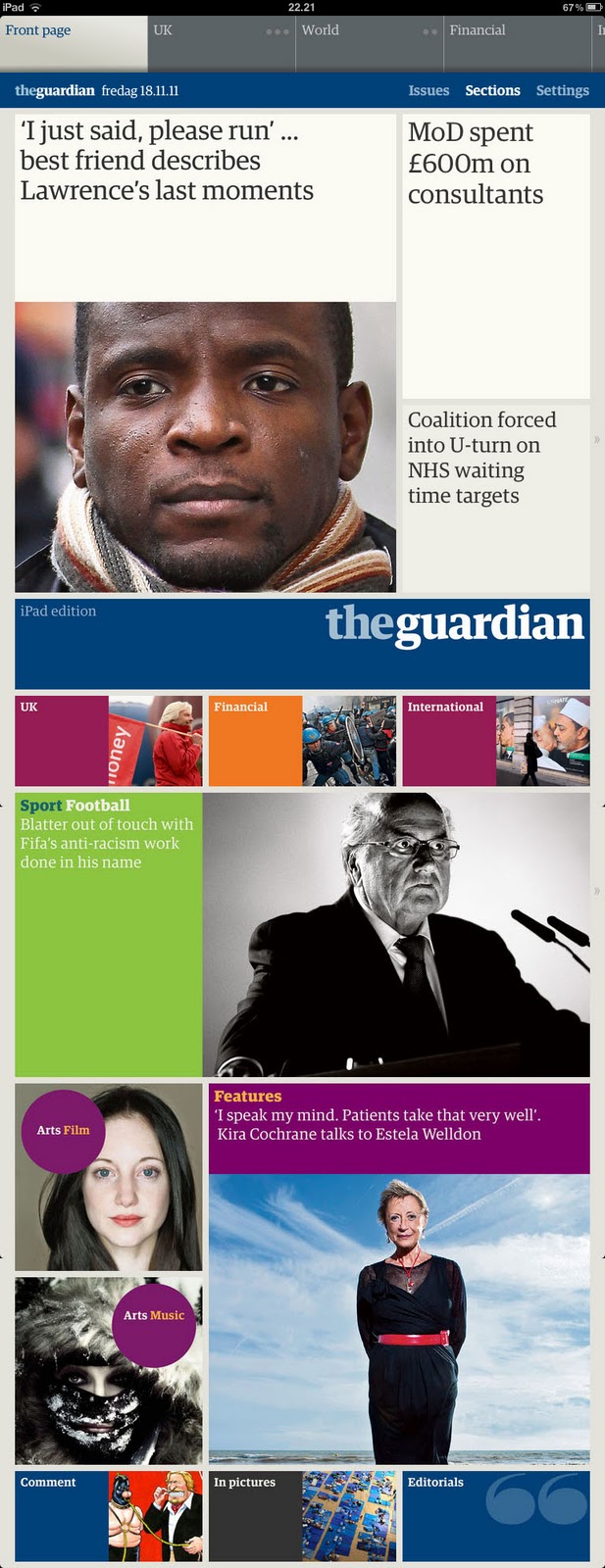
THE GUARDIAN iPAD APP is the most convincing and original response so far to the challenge of shaping a daily newspaper on the conditions of the tablet.

IN THE SAME WAY as early automobiles looked like horse carriages, the pioneers among newspaper and magazine apps have born a striking resemblance to their origin: newspapers and magazines. For this as well as other reasons, sometimes it might have been a bit hard to see what important needs this new publishing format was actually meeting … if you count away that luxurious feeling of being able to read your Danish morning paper by an Italian swimming pool.
It has been claimed that the so-called tablet has the potential to change our reading habits – and now all of a sudden, this statement sounds more plausible. An important change appeared two months ago when the British newspaper The Guardian launched its long-awaited iPad app. Which looks nothing like a newspaper. It looks like a Mondrian painting. Or, even more perhaps, it looks like a Montana shelving system.

NAVIGATING IT will give you the same pleasant feeling as walking around inside a great piece of architecture or using a really well-designed tool. The surroundings are simple, beautiful, and functional, and using this application feels natural and intuitive from the very first visit.
The architecture is profoundly simple, based on a grid consisting of squares which can be combined to form rectangles of varying shapes and sizes. The typography has been completely adjusted to the grid and this contributes to the overall impression of quality.
Content-wise, the iPad version is based on the daily paper, and transformation into tablet format is done semi-automatically. A script analyzes the InDesign pages and reshapes the stories while preserving the editorial hierarchy. The publisher’s ambition is to give readers the same sense of overview as when browsing through a ”real” paper – in which headlines and other ”landing spots” on the pages will give you a taste of all the stories, even the ones you decide to skip.

IN MY EYES, it does not work quite that way. Partly because some headlines, true to the anglo-saxon newspaper tradition, are more elegant than informative. This app inspires eclectic reading rather than it provides you with the complete overview offered by the traditional newspaper. However, reading the consistently well-written stories, typeset with the unique body type of The Guardian, on an iPad is an exquisite pleasure. And the video clips accompanying some articles make this reader feel like entering the world of Harry Potter.

CRITICAL VOICES have noted that the Guardian iPad edition is in fact outdated by the time of publication, just like the printed newspaper, and that it ought to include more interactive features such as readers’ comments. To me, this critique seems a bit misplaced; if you have a wish for constant updating, it can be perfectly fulfilled by the excellent Guardian website – to which, by the way, the iPad edition is linking comprehensively. This app is something else.

IT WILL BE INTERESTING to see how the elegant yet powerful colour palette marking the different sections – at the same time as it creates a very Guardianish atmosphere – will work when ”real” ads begin to appear on the pages. For the first four months, the entire publication is being sponsored by Channel 4, and outside the UK, their advertising space will be filled by The Guardian’s self-promotion.
The app, which was built for iOS 5 and works only on an iPad 2, comes for free until January 13, 2012. After then, a monthly subscription will get you rid of GBP 9,99.


01 december 2011

The Politiken redesign: Much ado about n…

POLITIKEN, the Danish morning daily which has won loads of design awards in recent years, launched a modest redesign today. Mediawatch asked me what I thought.
Here’s the interview – in Danish. In case you’re interested and do not read Danish, perhaps now is the time to test Google Translate …

Text by Tine Brødegaard Hansen

De oversælger redesignet”
Politiken slår lidt for meget på tromme for nyt design, som indtil videre giver mindre logik til broadsheet-formatet, mener designkonsulent Ole Munk.

Broadsheet-formatet får ikke mere liv af Politikens nye design, der skal sikre læserne bedre overblik og mere fokus på nyhederne, mener designkonsulent Ole Munk fra Ribergård & Munk, der har stået bag flere redesign af aviser.
“Det store problem er, at avisen ikke har stof til at udfylde de kæmpe sider. Derfor er det vanskeligt at begrunde, hvorfor avisen skal være broadsheet,” siger Ole Munk og tilføjer:
“Størrelsen på billederne er kun i få tilfælde berettiget, og for eksempel er det latterligt, at billedet af Margrethe Vestager på side 19 fylder en kvart side. Det tilfører ikke noget journalistisk til historien, og det er der mange af billederne som ikke gør.”


Side 8 og 9 domineres ikke af journalistiske billeder, men af en stor annonce, hvilket Ole Munk også hæfter sig ved.
”Når man læser de sider på en iPad, kan man se, at indholdet snildt kan være der, mens det fylder seks gange så meget i avisen.”
Det samme gør sig gældende for 2. sektions bagside, der ligeledes kunne være skaleret ned, og dermed havde virket bedre, mener Ole Munk.
Argumenterne om, at broadsheet sikrer overblik og giver plads til flotte grafiske elementer og fotos holder ikke helt, ifølge ham.
“Så mange fantastiske billeder er der ikke i avisen, så det sande argument for den størrelse er nok nærmere, at annoncørerne er glade for at få så meget plads.”
Afskaffelsen af nyhedsbåndet med citathistorier i toppen af siderne er den ændring, der får mest ros af Ole Munk.
“Nyhedsbåndet var en konstruktionsfejl fra starten, fordi det så ufattelig kedeligt ud, og fordi de små tekster var langt væk fra læserens øjne. Så det er en god idé, at der er lavet en mere iøjnefaldende løsning,” siger han om elementet ’overblik’ med korte historier, der nu er samlet i en sidespalte.
Ole Munk mener ligeledes, at ambitionen om at skabe mere overblik, blandt andet ved hjælp af avisens side 2, er vellykket.
”Politiken har mange gode folk, der kan deres grafiske håndværk, og man kan generelt sige, at overblikselementerne er veludførte og fungerer godt. De grafiske elementer hjælper læseren med at navigere i avisen,” siger Ole Munk.
Han mener dog, at der er slået lige lovlig meget på tromme for ændringerne, som har fået flere helsider op til det nye design gik i luften i dag.
”De oversælger redesignet og overvurderer også betydningen af ændringerne for oplevelsen af avisen. De ting, der er meget store, når man arbejder på avisen, er ikke så store og betydningsfulde for læserne. Så det kan virke lidt komisk. Retfærdigvis er Politikens læsere dog et nichesegment, der nok tillægger avisens design større betydning end andre avislæsere,” siger Ole Munk, som mener at avisens ”første forside”, der består af en humoristisk tegnet fortolkning af avisens normale forside, ikke ville fungere andre steder.
”Tegningen på forsiden er vidunderlig, og det sætter Politiken-læsere pris på. På Berlingske og Jyllands-Posten ville sådan en forside have været en katastrofe,” siger Ole Munk.

Politikens tegnede forside 1. december 2011:


12 november 2011

The fear of being original

IN A RECENT COLUMN at Medievarlden.se, the former editor-in-chief of Swedish local daily Västerbottens-Kuriren, Lasse Westerlund, suggests that newspapers should stop giving away their key product for free by publishing news on the web.
In numerous comments and tweets, mr Westerlund has been ridiculed as being regressive and, among other things, his opinions have been compared to those of an unimaginative steam engine driver in the early 20th century.
I totally agree that it would be more than stupid to try neglecting the fact that the internet is here to stay, and that the reading habits of people who (used to) buy newspapers are rapidly changing. However, if for a moment we put aside the question of technical platform (print, iPad, mobile, etc), there also seems to be quite a lot of stupidity – or, at least, lack of ability to think out of the box – in the way many newspapers just keep putting their highly valued goods at everyone’s disposal, including that of their competitors, without charging anything for the service.

ANOTHER EXAMPLE of thoughtlessly mimicking the behavior of others without considering the consequences is the way many newspapers allow advertising to totally dominate their visual environment, and thereby seriously hurt their own brand recognition (see an example here) as well as their esteem (for those who have got anything left to hurt).
So why is just about everyone running in the same direction? Few people would argue that giving away your product for free, or allowing some supermarket or car manifacturer to take over the visual gestalt of your news website, are intelligent strategies. More likely, these are behaviors deriving from a fear that if you do not make the same moves as all the rest, you might end up being the one who fails.

AS FOR GIVING AWAY NEWS FOR FREE, other strategies have in fact been tried. The whole discussion of paywalls is big and complicated and I do not imagine that I can make any intelligent or original contributions (just read that the website of the Financial Times now has more than 250,000 paying subscribers, but then again, business news is special) … but I would like to mention a different approach which appears to be successful.


IN DECEMBER 2010, overnight, NRC.nl (the website of Rotterdam-based dailies NRC Handelsblad and NRCnext) ceased to automatically publish all news from the two papers. After the initial couple of weeks filled with angry protests, users actually began to appreciate the new contents of the site and, according to NRC.nl editors, the number of visitors have now doubled compared to how things were before the change.
Instead of traditional news, NRC.nl now offers two parallel flows of content. One is named Het Beste van het Web (the Best of the Web) and works more or less like a traditional news aggregator, except that the stories, photos, videos and sound bites which it aggregates are not necessarily news – it can be any kind of content from everywhere on the web, as long as it is interesting.
The other flow contains comments, analysis, interviews, etc, related to stories which you can read if you choose to buy one of the papers.
For instance, if the NRC print (and tablet) publications are writing about the European debt crisis – which, no doubt, they are – an NRC.nl reporter might interview the financial expert at the NRC desk and make him or her explain how the whole international banking system works, or maybe list the strengths and weaknesses of the euro currency.
This works as a smart way to approach user segments different from the traditional newspaper audience and, at the same time, it is an effective method for NRC to promote their paid products.

NRC.nl DARED TO DO SOMETHING DIFFERENT – and something original. Apparently, they have succeeded. However, as the internet is still such a young media, or whatever you’d call it (whether the internet can be called a media or not seems like a never-ending discussion), there has to be hundreds of other ways to capitalize on its possibilities.
Therefore, it is not necessarily stupid to state that newspapers should try something else instead of just publishing their news and hoping that advertising will pay. Because that business model clearly isn’t working.

In case you are interested, you can read more about the NRC.nl project in a review which I wrote for the Danish Journalisten magazine earlier this year.